Are your teams struggling to turn large volumes of data into clear, actionable insights? Do decision-makers often ask for a single view that shows exactly what is happening across the business? This is where Power BI Dashboard Development becomes essential. According to the Forrester Total Economic Impact™ of Microsoft Power BI, organisations using Power BI achieved a 366% ROI over three years, largely due to faster decision-making and improved data visibility.
Dashboards matter because they convert raw data into simple, visual, and meaningful insights. They help business users monitor KPIs at a glance, reduce reporting delays, and provide a true single pane of glass for operational visibility.
Power BI stands out as a leading dashboard platform thanks to its strong integration with the Microsoft ecosystem, scalable architecture, and rich interactive visuals that support fast analysis.
This blog will walk you through a practical, how-to guide for building high-quality dashboards in Power BI from planning and dataset design to performance tuning, deployment, and ongoing maintenance.
By the end, you’ll know how to go from a raw dataset to a production-ready dashboard that delivers real-time insight and real business value.
Move Beyond Legacy Systems and Embrace Power BI for Better Insights!
Partner with Kanerika Today.
Key Takeaways
- Plan before building: Know your audience, identify key metrics, set refresh needs, choose devices, and define governance early.
- Build a strong dataset: A clean semantic model, proper relationships, and efficient DAX measures make the dashboard fast and reliable.
- Design with purpose: Highlight important KPIs, keep the layout simple, and follow a clear reading flow from top-left to bottom-right.
- Optimise for performance: Reduce dataset size, use incremental refresh, and avoid heavy visuals. Plan refresh schedules carefully.
- Deploy with structure: Use development, test, and production workspaces. Follow ALM practices and set proper permissions.
Understanding Dashboards vs Reports in Power BI
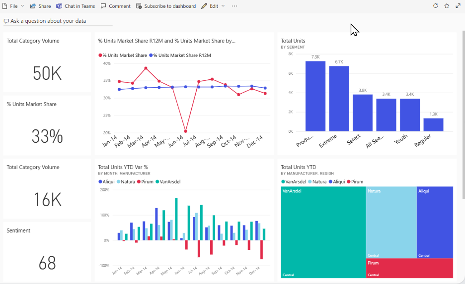
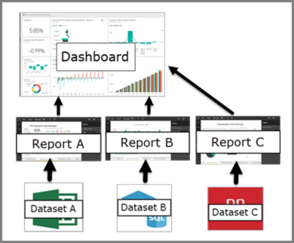
In Power BI, it’s essential to distinguish between dashboards and reports, as both play different roles in delivering insights. A dashboard is a single-canvas view created in the Power BI Service, where users can pin visuals known as tiles from one or more underlying reports and datasets. It acts as a high-level, consolidated snapshot of business performance, enabling users to monitor metrics at a glance.
In contrast, a report is a multi-page, highly interactive analytical document built in Power BI Desktop. Reports allow detailed exploration through slicers, filters, drill-throughs, bookmarks, and custom interactions. While reports are designed for deep analysis, dashboards are intended for fast, decision-oriented monitoring.
Understanding the architecture helps clarify the relationship:
Dataset → Report → Dashboard
The dataset forms the semantic layer where data modelling, calculations, and relationships are defined. Reports sit on top of this layer, providing analytical flexibility, while dashboards sit above reports as the summarised delivery layer.
For data engineers, this separation is crucial. You design and optimise the dataset and reports with proper modelling and transformation logic, ensuring they power meaningful dashboard tiles. The dashboard is then crafted strategically to surface only the most actionable insights.

Planning Your Dashboard Development
Before building a Power BI dashboard, planning is one of the most important steps. A well-planned approach helps you avoid rework, ensures clarity, and keeps your development aligned with business goals. The first thing to consider is your audience. Understanding who will use the dashboard, how often they will view it, and what decisions they need to make helps you choose the right visuals and layout.
Next, you should think about the metrics, data sources, performance requirements, and update cycles. These factors guide not only the design but also the technical foundation behind the dashboard. Clear decisions at this stage allow data engineers to structure their models properly and avoid issues in later phases.
Here are the key steps to include during planning:
- Identify key metrics/KPIs: Determine what the dashboard must surface—such as sales, margin, or delivery performance—and map each KPI to the correct dataset.
- Determine data sources: Decide whether your data will come from Excel, SAP, SQL databases, Data Lakes, or cloud services. Also check if you need ETL/ELT pipelines to clean or integrate source data.

- Define the refresh strategy: Choose whether the dashboard needs real-time, hourly, or daily updates. Decide between Import or DirectQuery based on speed and data volume.
- Choose layout and device targets: Plan whether the dashboard will be viewed on a desktop monitor, mobile device, or a large team screen.
- Set governance and ownership: Establish who builds the dashboard, who approves changes, and how you will manage updates or deployments, especially if you use ALM or promotion pipelines.
Good planning ensures that your dashboard is both technically strong and business-ready.
With a solid plan in place, we’ll move into creating the dataset and report.
Building the Underlying Dataset and Report of Power BI Dashboard
After planning your dashboard, the next stage is building the dataset and the report that will power it. As a data engineer, your role here is crucial. You design the data model, define the right relationships, create accurate measures, and ensure that everything performs smoothly. This strong foundation helps the dashboard deliver clear, fast, and reliable insights.
To do this effectively, it is important to focus on both technical structure and data quality. A well-built dataset not only improves report performance but also makes the dashboard easier to maintain. Clear modelling, clean data, and consistent calculations ensure users can trust what they see.
Below are the key areas to work on during this phase:
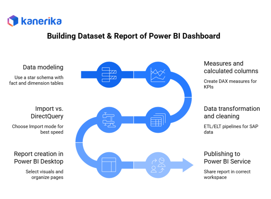
- Data modeling: Use a star schema with fact and dimension tables. This structure supports fast performance and makes relationships easier to manage. It also helps dashboard visuals load quickly and respond smoothly to filters.
- Measures and calculated columns: Create DAX measures for KPIs and calculations. Use calculated columns only when needed. This helps improve performance and reduces memory usage.
- Data transformation and cleaning: If you are working with SAP or large enterprise data, you may need ETL/ELT pipelines using PySpark, Dataflows, or Microsoft Fabric. Clean, standardised data leads to cleaner visuals and fewer errors.
- Import vs. DirectQuery: Choose Import mode for best speed and compression. DirectQuery is useful for real-time needs but may lead to slower interactions due to live queries.
- Report creation in Power BI Desktop: Select the right visuals, organise report pages, define drill-through options, add slicers, and use bookmarks for interactive navigation.
- Publishing to Power BI Service: Once the report is final, publish it to the correct workspace for sharing and dashboard creation.
Along the way, make sure your dataset stays optimised. Remove unused columns, use proper data types, and create summary tables when possible. A clean model leads to a clean dashboard.
Once the report is ready and published, the next step is to create the dashboard and pin the right visuals.

Creating the Dashboard in Power BI Service
Once your report is published to Power BI Service, you can start building the dashboard. This step is simple but requires careful choices to ensure the final view is clear and useful. A dashboard in Power BI Service acts as a summary layer, so every visual you add should serve a specific purpose.
To create a dashboard, follow these steps:
- Open your report in Power BI Service.
- Hover over the visual you want to use.
- Click the pin icon to add the visual to an existing dashboard or create a new one.
- If you want more interactivity, you can also pin an entire report page as a live page. This option allows users to interact with slicers and filters directly on the dashboard.
After pinning, give your dashboard a clear and meaningful name. Also, choose the correct workspace so that the right team members can access it. Take a moment to check permissions and decide who can view, edit, or manage the dashboard.
While creating dashboards, keep a few limitations in mind. Some formatting from the report may not carry over when visuals are pinned, and interactions between tiles are limited. Also, you cannot build new visuals directly on the dashboard, especially if they need multiple datasets.
A useful practice is to create dedicated “Dashboard View” pages in your report. These pages contain simplified visuals arranged specifically for dashboard pinning. This approach keeps the dashboard neat and consistent.
Finally, remember that dashboard tiles refresh based on dataset refresh settings. If the dataset refreshes daily or hourly, the dashboard will update accordingly.
With the dashboard in place, let’s look at how to design it for maximum readability and actionability.

Power BI Dashboard Design Best Practices
Design plays a major role in how effective your Power BI dashboard becomes. Even if your dataset and report are well-built, a poorly arranged dashboard can confuse users or hide important insights. Therefore, it is important to follow proven design practices that keep the dashboard clear, simple, and easy to use. Microsoft Learn provides several helpful guidelines, and the points below expand on them in a practical way.
Here are the key best practices to follow:
- Consider your audience: Understand who will use the dashboard, how often they will view it, and what device they will use. This helps you select the right layout, visual size, and level of detail.
- Tell a story on one screen: Try to keep all key insights within a single canvas so users get the full picture at a quick glance without scrolling.
- Accent the most important information: Place key metrics in card visuals and position them in the top-left area, which is where users naturally look first.
- Placement and reading flow: Arrange visuals from top-left to bottom-right. This follows natural reading patterns and helps the user move smoothly from one insight to the next.
- Use the right visual type: Avoid 3-D visuals and use pie or donut charts only for very small category sets. Simple charts are easier to read and understand.
- Maintain consistency: Use consistent colours, axis scales, and formatting. Avoid mixing very large and very small values in the same visual.
- Minimise clutter: Remove unnecessary labels, reduce background noise, and avoid placing too many visuals on the dashboard.
- Explore advanced design ideas: Consider using design principles such as Gestalt or Tufte to improve clarity and reduce cognitive load.
For data engineers and BI teams, a few extra tips can help:
- Use themes to keep colours and branding consistent.
- Use Focus Mode to highlight important visuals when needed.
- Plan mobile layout early using Power BI’s mobile canvas feature.
- Create dedicated dashboard pages in the report for clean pinning and link them to deeper drill-through pages.
Design is critical—but so is performance and deployment. Let’s explore those next.
How to Migrate from SSRS to Power BI: Enterprise Migration Roadmap
Discover a structured approach to migrating from SSRS to Power BI, enhancing reporting, interactivity, and cloud scalability for enterprise analytics.
Performance, Refresh & Deployment Considerations
As you move closer to publishing your dashboard, performance and deployment become key factors. A dashboard may look good, but if it loads slowly or refreshes inconsistently, users will lose trust in it. Therefore, it is important to understand what affects performance and how to manage refresh and deployment in a stable way.
Performance is influenced by several areas: the size of your data model, the amount of query load on your dataset, the complexity of your visuals, and how often the data refreshes. Larger datasets and complex visuals naturally take longer to process, so keeping things simple and structured helps improve speed.
To keep performance strong, follow these best practices:
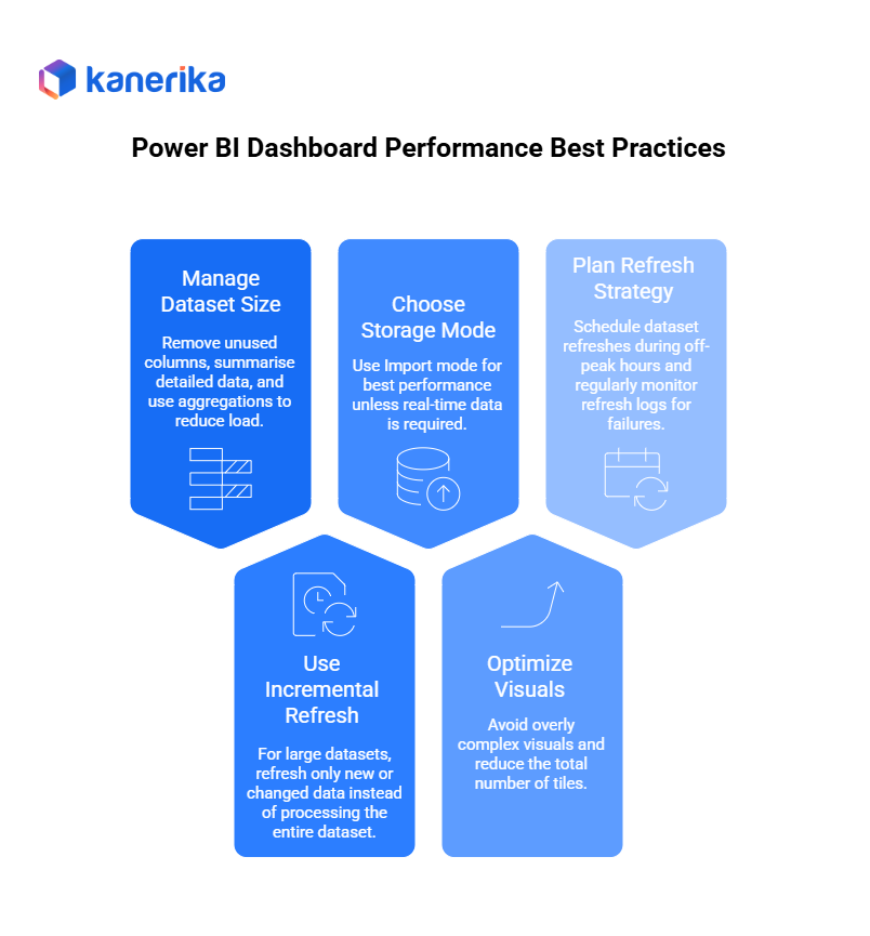
- Keep dataset size manageable: Remove unused columns, summarise detailed data when possible, and use aggregations to reduce load.
- Use incremental refresh: For large datasets, incremental refresh saves time by refreshing only new or changed data instead of processing the entire dataset.
- Choose the right storage mode: Use Import mode for best performance unless real-time data is required. If you use DirectQuery, plan for slower load times and higher query dependencies.
- Optimize visuals: Avoid overly complex visuals and reduce the total number of tiles. Make sure visuals use efficient DAX measures.
- Plan a refresh strategy: Schedule dataset refreshes during off-peak hours and regularly monitor refresh logs for failures.
Deployment is another important area, especially for teams that follow engineering best practices. To manage deployment smoothly:
- Use separate workspaces for development, testing, and production.
- Follow ALM practices: Keep PBIX files under version control and use Power BI deployment pipelines or promotion workflows.
- Manage permissions carefully: Set correct workspace roles, secure datasets, and apply Row-Level Security (RLS) where necessary.
- Maintain governance: Use clear naming conventions, document your dashboards, assign ownership, and track usage to ensure accountability.
Finally, let’s talk about how you roll out the dashboard and ensure adoption and maintenance.

Monitoring, Adoption & Maintenance
Once your Power BI dashboard is live, the work is not over. In fact, this is where long-term value is created. A dashboard must be monitored, updated, and supported regularly to stay useful. Business needs change, datasets evolve, and user expectations grow. Therefore, ongoing monitoring, adoption planning, and maintenance are essential for lasting success.
To keep your dashboard effective, it helps to track how it is being used and how well it performs. This information guides improvements and ensures the dashboard continues to meet business goals.
Here are some helpful monitoring practices:
- Use usage metrics: Power BI Service provides insights on who is viewing the dashboard, how often they access it, and which tiles get the most attention.
- Collect user feedback: Ask business users whether the KPIs are meaningful and whether the visuals are easy to understand.
- Update periodically: Review the dashboard as business priorities and data sources change. Adjust the metrics or visuals when needed.
- Remove stale content: Clean up old dashboards or unused tiles to maintain clarity and reduce confusion.
To improve adoption across teams, use simple and supportive strategies:
- Offer training or guides: Provide a quick “how to use this dashboard” document or video.
- Embed in workflows: Add the dashboard to Teams, SharePoint, or mobile apps to make access easier.
- Use alerts and subscriptions: Allow users to receive notifications when key metrics reach certain thresholds.
For long-term maintenance, follow a regular checklist that includes reviewing dataset health, checking refresh logs, monitoring performance, and validating visual relevance.
By keeping your dashboard updated and aligned with real business needs, you ensure that it continues to deliver value over time.
Real-World Example of Power BI Dashboard Deployment
To understand how a well-designed Power BI dashboard adds value, let’s look at a practical, anonymised example inspired by real scenarios common in large manufacturing and supply-chain organisations that run on SAP systems. Many global companies such as Unilever use SAP ERP for order and delivery management
Although the following case study is fictional, the workflow, challenges, and outcomes reflect real industry situations.
Challenge
Unilever’s sales and delivery teams struggled with fragmented data. They lacked a consolidated view of open orders, shipment status, and margin performance across regions. Data lived in multiple SAP modules, leading to delays in decision-making and inconsistent reporting across teams.
Dataset
To solve this, we integrated:
- SAP Order-to-Cash (O2C) open orders extract
- Delivery and shipment tables
- Margin calculation logic
- Currency conversion tables for multi-country reporting
These datasets were cleaned and transformed before building a semantic model.
The Report
We created a structured data model using fact and dimension tables and defined DAX measures for margin %, delivery status, and currency conversion. Drill-through pages were added to help users analyze delivery delays and customer-wise performance.
The Dashboard
The dashboard featured:
- KPI cards: Total Open Orders, On-Time Delivery Rate, Margin % by Region
- Bar chart showing order volume by country
- Trend line for margin over time
- Links to detailed report pages for deeper analysis
Design choices included placing “Total Open Orders” at the top-left, using a consistent colour palette, avoiding pie charts, and preparing a mobile-friendly version for field teams.
Outcome
Managers could now monitor KPIs at a glance, drill into issues instantly, and track updates every 4 hours. Usage metrics showed 60% adoption among regional managers within weeks.
Kanerika: Elevating Your Reporting and Analytics with Expert Power BI Development Solutions
Kanerika stands at the forefront of technological innovation, delivering cutting-edge solutions that redefine how businesses deploy, manage, and scale their analytics platforms. As a premier Microsoft-certified Data and AI Solutions Partner, we specialize in transforming complex deployment challenges into seamless, enterprise-grade Power BI environments that accelerate decision-making and operational intelligence.
Our approach goes beyond basic dashboard creation. We design and implement end-to-end Power BI development strategies that unify governance, security, scalability, and performance. Whether supporting manufacturing, finance, healthcare, or retail, Kanerika ensures that Power BI is deployed with the highest reliability—across workspaces, environments, and user groups.
With deep expertise in Microsoft’s advanced analytics stack, including Power BI, Microsoft Fabric, and enterprise data services, we build intelligent dashboards, streamline report lifecycle management, and establish strong deployment pipelines. Our team of analysts, engineers, and data scientists work collaboratively to ensure your analytics ecosystem runs smoothly with structured environments, automated updates, and optimized performance.
Through intelligent Power BI development, Kanerika empowers organizations to make data-driven decisions with greater precision, improve operational excellence, and unlock the full value of their enterprise data.
Transform Your Data Strategy with Power BI’s Advanced Capabilities
Partner with Kanerika Today.
FAQs
1. What is Power BI Dashboard Development?
Power BI Dashboard Development refers to the process of designing, building, and deploying dashboards in Power BI Service. It involves creating datasets, reports, visuals, and interactive tiles that give users a single, high-level view of their key business metrics.
2. How is a Power BI dashboard different from a report?
A dashboard is a single-page summary view made up of pinned visuals (tiles), while a report can have multiple pages, slicers, and deeper interactivity. Dashboards provide quick insights, whereas reports allow detailed analysis.
3. What skills are needed for Power BI Dashboard Development?
Key skills include data modelling, DAX calculations, visualization best practices, understanding of Power BI Service, refresh strategies, and basic knowledge of deployment and governance.
4. What are best practices for building Power BI dashboards?
Focus on your audience, keep the layout simple, highlight key KPIs, use consistent visuals, minimize clutter, and optimise your underlying data model for performance.
5. How can I improve the performance of my Power BI dashboard?
Use optimized data models, remove unused columns, apply incremental refresh, avoid heavy visuals, choose Import mode when possible, and schedule refreshes during off-peak hours.
6. Can I share a Power BI dashboard with other users?
Yes. Dashboards can be shared through Power BI Service with proper workspace permissions, app deployment, or secure sharing within your organisation.
7. How often should a Power BI dashboard be updated?
Refresh frequency depends on business needs. Many teams use daily or hourly refreshes. For large datasets, incremental refresh ensures faster and more efficient updates.


