In May 2025, Microsoft Power BI continues to lead the business intelligence space, recently earning recognition in Forrester’s Q2 2025 BI Platforms Wave report. With advancements like Copilot integration and AI-powered insights, Power BI is not only simplifying data analysis but also making it more accessible to non-technical users. These innovations reflect Microsoft’s commitment to transforming how organizations interact with their data.
What sets Power BI apart is its deep integration with the Microsoft ecosystem, particularly Microsoft Fabric. Fabric brings together data engineering, data science, and real-time analytics into one unified platform. With native OneLake support and a shared workspace experience, users can create reports faster and more collaboratively than ever before—without leaving the Power BI interface.
In this blog, we’ll explore one powerful feature: creating a quadrant chart using a color scatter plot in Power BI. Whether you’re mapping customer segments, product positioning, or performance metrics, this visualization can help you uncover patterns and make strategic decisions with clarity.
What is a Quadrant Chart Using Color Scatter Plot in Power BI?
A quadrant chart is a type of scatter plot that divides the visual space into four segments using reference lines on the X and Y axes. This is typically done to analyze the relationship between two variables.
For instance, you might plot “Margin Percentage” on the Y-axis and “Discount Percentage” on the X-axis to segment your data into:
- High margin & low discount
- High margin & high discount
- Low margin & low discount
- Low margin & high discount
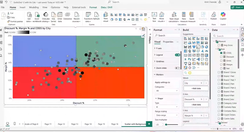
The Quadrant Chart Using Color Scatter Plot in Power BI enhances this by adding color to each of the four quadrants, making it visually easier to distinguish between them.
This means you no longer just see scattered data points; you see the clear backdrop of each quadrant, which provides a quicker and clearer understanding of data patterns and helps highlight key insights.
Why Color the Quadrants (Background) Instead of Just the Bubbles?
In traditional scatter plots, data points (or bubbles) are often colored based on a category or value. However, this doesn’t help much when trying to clearly separate your data into specific sections based on different performance levels. Coloring the quadrants instead of just the bubbles provides several advantages:
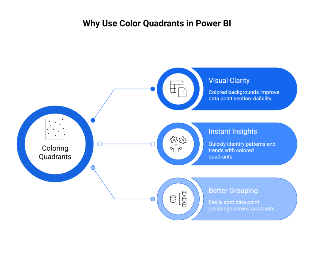
1. Visual Clarity: The colored background makes it much easier to see which section the data point belongs to.
2. Instant Insights: With colored quadrants, it’s easy to identify patterns, anomalies, or trends without having to interpret each point individually.
3. Better Grouping: It’s simpler to spot how different data points group together across the four quadrants—this is especially useful in business scenarios like performance analysis, where you need to quickly identify areas of strength or weakness.
Understanding Reference Line Enhancements in Power BI
The new reference line enhancements bring valuable improvements to creating quadrant charts. Below is a breakdown of the new features and how they work:
| Feature | Description | Why It Matters |
| Reference Lines | Horizontal and vertical lines that divide the plot into sections. | Helps create quadrants, making it easier to categorize data. |
| Shaded Areas for Reference Lines | Now you can apply shading to areas before and after the reference line. | Provides visual boundaries for each quadrant. |
| Position of Reference Lines | Reference lines are placed behind shaded areas. | Ensures shaded areas are visible and do not overlap data points. |
| Dynamic Reference Lines | Reference lines on the Y-axis can be dynamic, adjusting based on data. | Automatically adjusts as your data changes (e.g., margin or discount). |
| Coloring Options | Ability to apply different colors and transparency levels to quadrants. | Creates clear visual distinction between different data sections. |
| Limitations | Multiple reference lines and coloring both sides of a line are limited. | Future updates will likely improve this, providing more customization. |
How to Set Up the Quadrant Chart Using Color Scatter Plot in Power BI
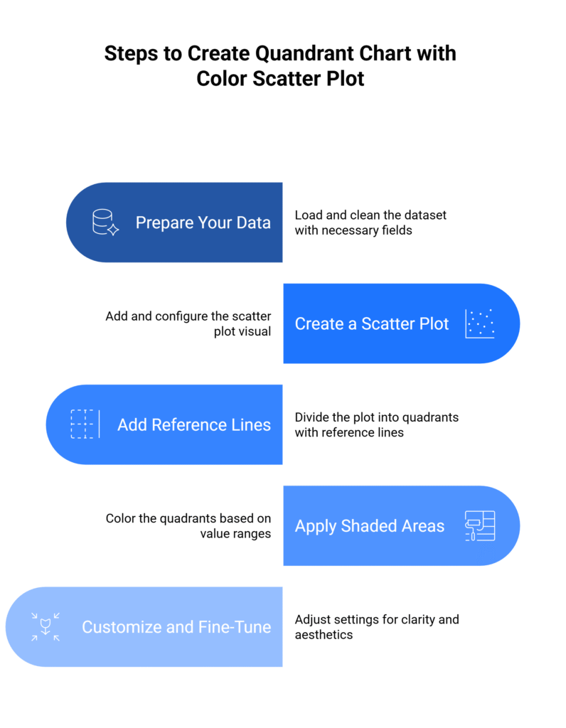
1. Prepare Your Data
- Load your dataset with fields like Margin Percentage (Y-axis) and Discount Percentage (X-axis).
- Ensure your data is clean, and the measures like margin and discount percentages are calculated.
2. Create a Scatter Plot
- Add a Scatter Plot visual.
- Assign Discount Percentage to the X-axis and Margin Percentage to the Y-axis.
- Resize the plot for clarity.
3. Add Reference Lines
Add reference lines at 0% on both axes to divide the plot into quadrants.
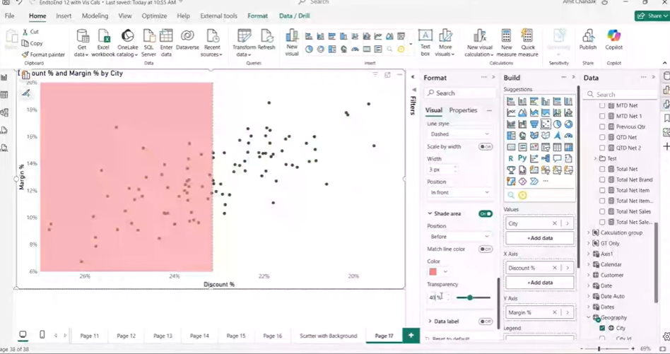
4. Apply Shaded Areas
- Enable shaded areas for both axes to color the quadrants.
- Choose colors like red/yellow for low values and blue/green for higher ones. Adjust transparency to keep data visible.
5. Customize and Fine-Tune
- Adjust reference line positions, transparency, and bubble sizes.
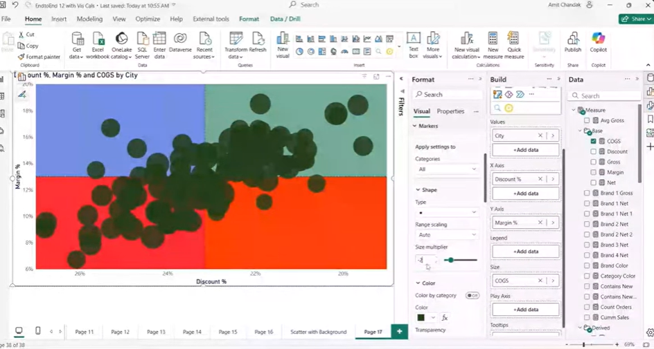
- Apply conditional formatting to highlight additional measures (e.g., COGS, Net Sales).
How to Set Up the Scatter Plot Axes in Power BI
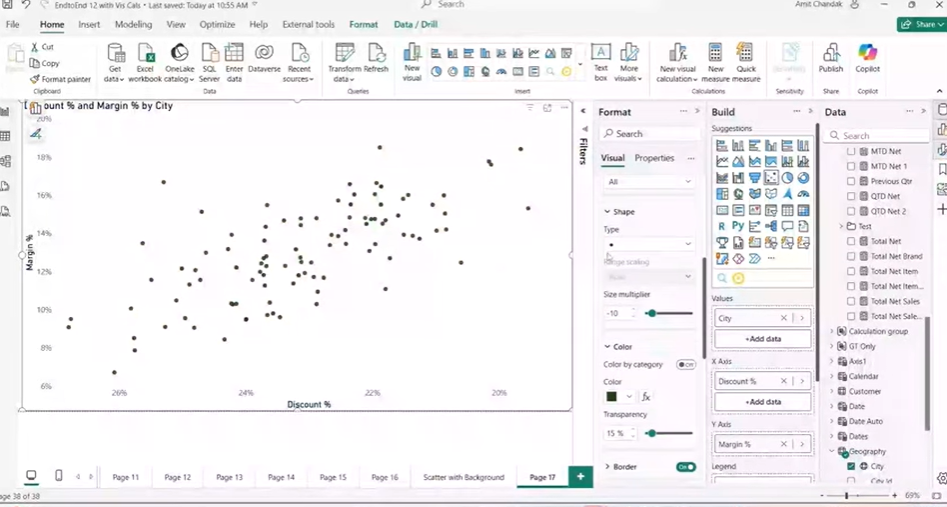
- Assign Margin Percentage to the Y-Axis: These positions data vertically, with higher margins appearing higher on the chart.
- Assign Discount Percentage to the X-Axis: This controls horizontal positioning, with higher discounts placed on the right.
- Use Geography (Optional): Add Geography to segment data regionally if needed.
- Invert the X-Axis Scale: Reverse the X-axis to ensure low discount values are on the left and high values are on the right, keeping quadrants aligned.
Steps to Add Reference Lines and Coloring the Quadrants in Power BI
- Add Constant Reference Lines: Insert reference lines for both axes to divide the plot into quadrants based on Margin and Discount.
- Enable Shaded Areas: Color quadrants like red for low margin/high discount, yellow for low margin/low discount, blue for high margin/high discount, and green for high margin/low discount. Adjust transparency to keep data points visible.
- Position Reference Lines Behind Data Points: Ensure reference lines don’t block the bubbles by positioning them behind the data points.
How to Enhance Scatter Bubbles with Size and Color in Power BI
Power BI offers a powerful way to enhance scatter plots by adjusting bubble size and bubble color, helping to convey more information in a single chart. This can make your data easier to analyze and provide clearer insights.
1. Use Bubbles to Show Additional Measures
- Bubble Size: Represent additional data, like COGS (Cost of Goods Sold) or Sales Volume, by adjusting the size of the bubbles. For example, larger bubbles could represent higher sales, allowing you to spot your biggest-selling products instantly.
- Bubble Color: Use conditional formatting to color the bubbles based on measures like Net Profit or Revenue. For instance, green could indicate products with high profit, while red might highlight those with low or negative profit, helping you spot trends quickly.
2. Apply Conditional Formatting with Gradients
Set up a color gradient to show variations in performance. For example, use a scale from red (for low profit) to green (for high profit). This instantly visualizes performance across your data, making it easy to identify strong and weak areas.
3. Adjust Bubble Size
Ensure the bubble sizes fit within the data range. Adjust the minimum and maximum values for bubble size so that the plot remains proportional. Proper scaling ensures that the chart isn’t cluttered, and each data point is clearly visible.
Why Use Bubble Size and Color?
By using bubble size and color together, you create a multi-dimensional visual representation. This makes the scatter plot more dynamic and informative. Instead of just showing the relationship between two variables, you’re also displaying performance, volume, or other important metrics, all in a single view.
Use Case: Analyzing Product Performance with Quadrant Charts in Power BI
Scenario: Retail Business Performance Analysis
Imagine you work for a retail company that wants to analyze product performance based on profit margin and discount percentages. The company runs frequent sales, and the marketing team is always looking for the optimal balance: offering discounts without sacrificing too much margin.
The marketing team needs a tool to easily visualize and categorize products to understand which products are performing well and which are underperforming. This is where the Quadrant Chart Using Color Scatter Plot in Power BI comes into play.
Step 1: Data Preparation
Your dataset includes columns for product names, profit margin, and discount percentages. You also have sales data for each product.
Step 2: Set Up the Scatter Plot
You create a scatter plot with Profit Margin on the Y-axis and Discount Percentage on the X-axis.
Step 3: Add Reference Lines
You add reference lines at 0% margin (Y-axis) and 0% discount (X-axis). These lines divide the chart into four quadrants:
- Top-right quadrant: High profit margin, high discount (potentially good for aggressive promotions)
- Top-left quadrant: High profit margin, low discount (ideal products)
- Bottom-left quadrant: Low profit margin, low discount (products to reconsider)
- Bottom-right quadrant: Low profit margin, high discount (danger zone for profit loss)
Step 4: Color the Quadrants
You enable the shaded area for both X and Y-axis reference lines and color each quadrant differently:
- Green for the Top-left quadrant (high margin, low discount) – the best performance zone.
- Red for the Bottom-right quadrant (low margin, high discount) – the worst performance zone.
- Yellow for the Bottom-left quadrant (low margin, low discount) – products to monitor or adjust.
- Blue for the Top-right quadrant (high margin, high discount) – products that are in a high-risk, high-reward position.
Step 5: Analyze and Take Action
With the background color now segmented into these four quadrants, it’s easy to spot where most of the products lie. You might find:
- High margin, low discount products in green, indicating great profitability with conservative pricing.
- Low margin, high discount products in red, which signals that the company might be losing money due to over-discounting.
- Top-right quadrant products in blue, which may need re-evaluation of their discount strategies to optimize profits.
Benefits of Using the Quadrant Chart
- Clarity: The quadrant chart helps quickly identify which products are performing well and which are underperforming based on both margins and discount levels.
- Better Decision-Making: With colored quadrants, the marketing team can immediately identify where to focus their efforts—whether they need to increase the price, reduce the discount, or re-strategize the discounting for underperforming products.
- Time-Saving: Instead of manually reviewing rows of data to spot trends, the quadrant chart gives an instant visual overview, making it much faster to take action.
Kanerika’s Data Modernization Services: Minimize Downtime, Maximize Insights
As a premier data and AI solutions company, Kanerika understands the importance of moving from legacy systems to modern data platforms. Upgrading to modern platforms enhances data accessibility, improves reporting accuracy, enables real-time insights, and reduces maintenance costs. Businesses can leverage advanced analytics, cloud scalability, and AI-driven decision-making when they migrate from outdated systems.
However, manual migration processes are time-consuming, error-prone, and can disrupt critical business operations. A single misstep in data mapping or transformation can lead to inconsistencies, loss of historical insights, or extended downtime.
To solve this, we’ve developed custom automation solutions that streamline migrations across various platforms, ensuring accuracy and efficiency. Our automated tools facilitate seamless migrations from SSRS to Power BI, SSIS and SSAS to Fabric, Informatica to Talend/DBT, and Tableau to Power BI, reducing effort while maintaining data integrity.
Partner with Kanerika for smooth, automated, and risk-free data modernization services.
Microsoft Fabric vs Power BI: How They Differ and Which One You Need
An in-depth comparison of Microsoft Fabric and Power BI, explaining their differences, use cases, and how to choose the right solution for your data and analytics needs.
FAQs
How to change scatter plot color in Power BI?
To make changes in the chart color, go to the Format pane and select Data colors. You will see that blue is the default color. There are various options to change the color. You can select from the options, or click on Custom color to select a custom color as shown below.
What is the difference between a scatter plot and a scatter chart?
A scatter plot, also called a scatterplot, scatter graph, scatter chart, scattergram, or scatter diagram, is a type of plot or mathematical diagram using Cartesian coordinates to display values for typically two variables for a set of data.
How do you plot a chart in Power BI?
The first step to plot any kind of plot in Power BI is to select the plot template/type from the Visualization panel. Click on the scatter chart icon in the visualization panel and drag the columns to the respective -Axis field as shown in the below figure.
How to create a scatter plot in Power BI?
- Create a scatter chart
- On the Data pane, select three fields.
- Select the chart visual, and then select Scatter chart on the Visualizations pane. …
- On the Visualizations pane, drag the District field from the Values section to the Legend section.
How to change chart color in Power BI?
To change color based on a value, select a visualization to make it active. Open the Format pane by selecting the paint brush icon and then search for the Colors card. Since our example uses a column chart, scroll down to Columns. Next to Default, select the fx icon.


