Microsoft Fabric has seen rapid growth in recent months, with over 21,000 paying customers as of April 2025—a nearly 80% year-over-year increase. Enterprises are adopting it not just for storage and processing, but as a unified platform for building data products across analytics, reporting, and AI.
One of the more powerful but often overlooked capabilities within Fabric is its semantic modeling layer, which now supports DAX Calculated Columns and Tables. This feature allows data teams to create model-level logic for custom groupings, aggregations, and time intelligence—without modifying the source data or adding ETL steps.
In this blog, we’ll walk through how to use DAX Calculated Columns and Tables inside Microsoft Fabric’s semantic model, explore practical use cases, and highlight where this functionality fits into enterprise data modeling workflows.
What Are DAX Calculated Columns & Tables in Microsoft Fabric?
DAX Calculated Columns and DAX Calculated Tables are powerful modeling features that allow data professionals to enrich and restructure their data directly within the semantic model—without modifying the underlying data sources.
These features are especially useful in custom semantic models in Microsoft Fabric, where reusable logic, hierarchical structures, and time intelligence are critical to building dynamic, high-performance reports.
DAX Calculated Columns
A calculated column is a new field added to an existing table. It uses a DAX expression to evaluate row-by-row logic. This is often used to:
- Classify or segment data based on business rules (e.g., region categories, status flags).
- Extract or derive additional attributes (e.g., first character of a string, year from a date).
- Support conditional formatting or grouping in visuals.
DAX Calculated Tables
A calculated table is a new table created using a DAX expression. Unlike columns, calculated tables are evaluated at the model level and are commonly used to:
- Build reusable dimensions like custom calendar tables.
- Aggregate data for faster reporting (e.g., summary tables).
- Filter or transform data that isn’t available in the raw source.
These tables exist only within the semantic model and are recomputed each time the model is refreshed.
Integration in Microsoft Fabric
Microsoft Fabric enables calculated columns and tables to be defined within the semantic model layer, offering flexibility similar to Power BI Desktop but in a unified enterprise environment. However, it’s important to note:
- Calculated elements cannot reference Direct Lake tables.
- They must rely on tables already in Import mode or created directly within the model.
When used properly, calculated columns and tables act as model-level logic that simplifies report development, improves reusability, and enhances performance by reducing the need for repeated calculations at the report level.
Partner with Kanerika to Modernize Your Enterprise Operations with High-Impact Data & AI Solutions
Steps to Set Up Your Workspace in Microsoft Fabric
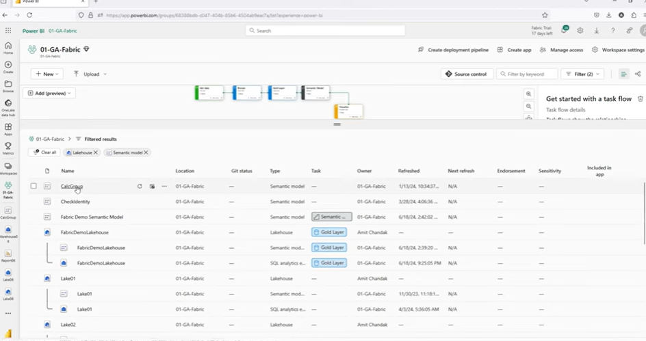
To begin working with DAX Calculated Columns and Tables in Microsoft Fabric, you need access to a properly configured workspace and a semantic model. In this guide, we’ll use a custom semantic model created within a workspace named ga10 fabric.
Step 1: Accessing Microsoft Fabric
Start by logging into Power BI online. Navigate to your Microsoft Fabric environment and locate your assigned workspace. In our case, the workspace is called ga10 fabric, which hosts several data assets including the custom semantic model we’ll work with.
Step 2: Understanding the Semantic Model Structure
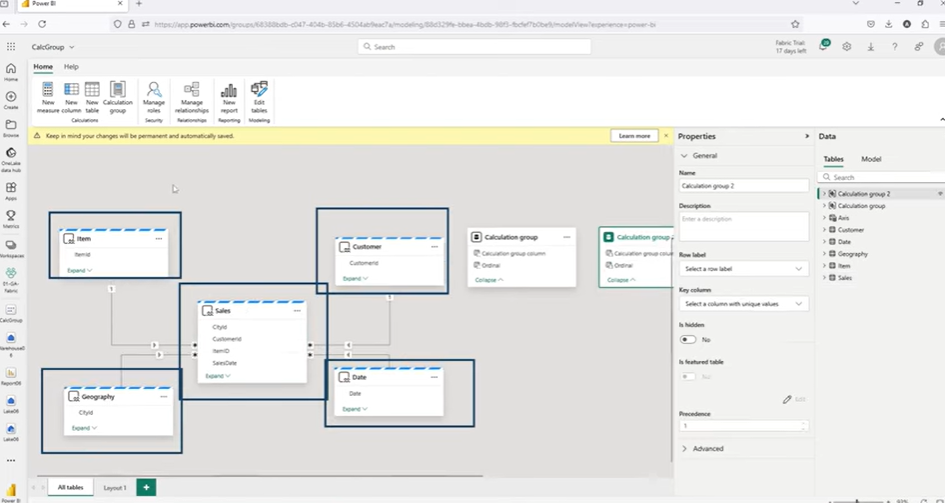
The semantic model used here is built on top of a warehouse named w01, and follows a typical star schema—an industry-standard structure that simplifies data relationships and enhances performance in analytical models.
Key Tables in the Model:
- Sales Table: This is the central fact table that contains transactional sales data.
- Date Table: A dimension table providing calendar-based information for time intelligence (e.g., month, year, quarter).
- Customer Table: Contains customer-related attributes such as names, IDs, and demographic details.
- Item Table: Includes product-level data such as item IDs, names, and brand details.
- Geography Table: Stores regional data to enable location-based analysis (e.g., country, state, region).
All these dimension tables—Date, Customer, Item, and Geography—are linked to the Sales fact table using one-to-many relationships, forming the star schema.
Step 3: Opening and Exploring the Model
From the workspace:
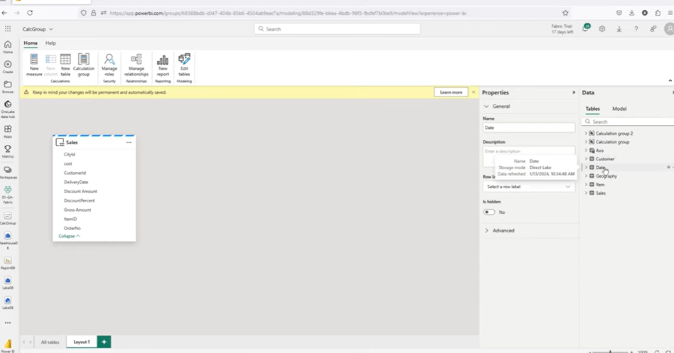
- Open the semantic model by selecting the relevant dataset and clicking on Open Data Model.
- Once the model opens, you’ll see all the tables and their relationships represented visually.
- Use the “All Tables” view to inspect how the dimension tables are joined to the sales table.
This foundational setup ensures you are ready to work with calculated columns and tables within Microsoft Fabric’s semantic modeling environment.
Understanding Limitations in Direct Lake Mode in Microsoft Fabric
While DAX Calculated Columns and Tables are powerful tools within Microsoft Fabric, it’s important to understand the limitations that come with using Direct Lake mode. These limitations directly affect where and how you can use calculated elements in your semantic model.
1. Exploring Feature Availability
Once you open the semantic model in the Power BI online interface, you may notice that the “New Column” and “New Table” options appear selectively based on the type of table you’re working with.
- When selecting the Sales table (sourced from Direct Lake), the “New Column” option is disabled.
- In contrast, when selecting a calculation group or a table created directly within the semantic model (import mode), both “New Column” and “New Table” options are enabled.
This indicates that the ability to create DAX-based calculated columns and tables is restricted to certain table types within the model.
2. Attempting to Create a Calculated Table Using Direct Lake Tables
To explore this further, a calculated table was attempted using the following DAX expression:

This formula aimed to group sales data by item brand and summarize it using the Net Sales measure.
However, upon execution, the model returned the following error:
“You cannot use a calculated table to reference a Direct Lake table. Please remove the calculated table.”
3. Interpretation of the Limitation
This error confirms a key limitation:
Calculated tables in Microsoft Fabric cannot directly reference tables in Direct Lake mode.
As a result, any table created using DAX must either:
- Rely solely on static logic (e.g., calendar generation), or
- Reference tables that are already in Import mode within the semantic model.
This distinction is critical when planning your model architecture, particularly when designing reusable dimensions or aggregation tables using DAX.
Creating a DAX Date Table in the Semantic Model in Microsoft Fabric
Since referencing Direct Lake tables in calculated tables is not supported, an effective workaround is to create a date dimension table using DAX functions directly within the semantic model. This approach allows you to build a reusable, structured calendar table in Import mode, which supports full-time intelligence features.
1. Defining the Table with DAX
The author begins by referencing a reusable DAX script for a standard calendar table, which has been demonstrated in previous tutorials. The DAX formula uses the CALENDAR and ADDCOLUMNS functions to generate a static date range along with time-related attributes.
Sample DAX Code:

This table, named Date_IND (short for Date Independent), is designed to operate independently of external sources and contains columns for:
- Year
- Month number
- Quarter number
The use of ADDCOLUMNS means that you’re creating not only a table but also extending it inline with new attributes in one step.
2. Why Create a Date Table This Way?
- This approach avoids referencing Direct Lake tables.
- The date range is explicitly defined, ensuring no missing dates for time-based aggregations.
- It allows you to implement sorting, joins, and date intelligence without dependency on external or imported calendar tables.
3. Naming Convention
While the table is named Date_IND to suggest it’s independent, the plan is to join it with the Sales table, making it functionally integrated into the model. This sets the stage for the next step: establishing a relationship between the new date table and the fact table.
How to Join and Configure the Date Table in Microsoft Fabric
After creating the Date_IND table using DAX, the next essential step is to integrate it into the existing semantic model. This involves establishing a relationship with the central Sales fact table and enabling it as a proper date table for time intelligence functions.
1. Creating the Relationship
To join the new date table with the Sales table:
- Open the model layout view where only the Sales table is initially visible.
- Drag the Sales[Date] field onto the Date_IND[Date] field.
- Microsoft Fabric suggests a many-to-one, single-directional relationship between Sales and Date_IND.
This relationship is accepted and saved—connecting the two tables and allowing the date dimension to filter sales records by time.
2. Marking as a Date Table
To enable full time intelligence capabilities, the Date_IND table must be explicitly marked as a Date Table:
- Right-click on the Date_IND table.
- Choose “Mark as Date Table” from the context menu.
- Select the appropriate column (Date) to serve as the primary date field.
- Click Save to confirm.
Once marked, Microsoft Fabric treats this table as a valid calendar dimension—ensuring accurate chronological behavior in time-based calculations such as Month-to-Date (MTD), Quarter-to-Date (QTD), and Year-to-Date (YTD).
3. Benefits of Marking as a Date Table
- Enables continuous date ranges in visuals.
- Supports built-in DAX time intelligence functions.
- Prevents aggregation errors due to irregular date intervals.
- Allows for consistent slicing and filtering across measures and visuals.
At this stage, the semantic model includes:
- A fact table (Sales) sourced from Direct Lake.
- A calculated date table (Date_IND) created in Import mode.
- A properly defined relationship between the two.
This setup prepares the model for visual validation and the implementation of calculated columns and groups in later steps.
Steps to Verify Date Sorting for Accurate Reporting in Microsoft Fabric
Once your Date_IND table has been created, joined to the Sales table, and marked as a date table, it’s essential to perform one final preparatory step: ensuring correct chronological sorting of date-related fields.
Even well-modeled semantic layers can produce misleading or disordered visuals if date fields are not sorted properly. In time-based reporting—such as monthly trends, quarter-over-quarter comparisons, or year-to-date summaries—this step is critical to maintain data clarity and reporting accuracy.
Step 1: Applying a Sort Order Using “Sort by Column”
Follow these steps to apply the sort order in your semantic model:
- In the model view, select the Month Year column in the Date_IND table.
- In the right-hand properties pane, locate the “Sort by column” option.
- Choose Month Year Sort as the corresponding sort field.
- Save the changes.
This ensures that your visualizations will render Month Year values in proper sequence, even if the data spans across multiple years or quarters.
Step 2: Consistency Across All Date Tables
If your model also includes other date tables—particularly those from Direct Lake mode, such as the original Date table—repeat the same sorting configuration:
- Apply a Sort by column setting for their respective Month Year fields, using the appropriate Month Year Sort column.
This is especially important if you plan to build comparative visuals using both tables side-by-side, as inconsistent sorting can lead to alignment issues or user confusion.
Step 3: Validating the Results
After applying the sort configuration, test your visuals by adding a time-based axis (e.g., a bar or line chart using Month Year) to confirm:
- Dates appear in chronological order.
- Period-over-period comparisons are aligned correctly.
- Time slicers respect the logical progression of time.
Getting the sorting logic right at this stage ensures all future visuals, time intelligence functions, and calculations behave as expected—minimizing manual corrections and maximizing data clarity for end users.
Building a Report with Calculated Tables in Microsoft Fabric
With the Date_IND table now fully integrated and configured, the next step is to test its utility by creating a report. The goal here is to validate that the calculated table functions correctly in a visual context—especially alongside the Direct Lake data.
This section walks you through setting up a basic report to compare and confirm the behavior of both the Import mode date table and the Direct Lake table.
1. Launching a New Report
From the Power BI interface in Microsoft Fabric:
- Click on “New Report” from your dataset’s options.
- This launches the report editor, where you can drag fields into visuals directly from your semantic model.
2. Visualizing Data Using the Import Mode Date Table
Start by building a simple line or column chart:
- Drag Date_IND[Month Year] into the Axis field.
- Drag the Gross measure (e.g., sum of Gross Amount) into the Values field.
The result should display time-based trends using your new calculated table—validating that the DAX-generated Date_IND is functioning as intended.
3. Creating a Parallel Visual with the Direct Lake Date Table
Now, replicate the previous visual using the Direct Lake-based Date table:
- Use the corresponding Month Year field from the Direct Lake table.
- Again, use the Gross measure in the Values field.
4. Comparing Results Across Both Date Sources
At this point, you should observe that both visuals render the same numerical results across the same periods. This confirms:
- Your calculated table (Date_IND) is joined correctly with the Sales table.
- Sorting and relationships are configured properly.
- The time intelligence behavior is consistent, even though one table is in Import mode and the other is in Direct Lake mode.
5. Saving the Report
After validating the visuals:
- Save your report under a clear name, such as Test_Calculated_Tables_Columns.
- This report serves as a checkpoint, confirming that your DAX table functions well in downstream reporting.
How to Work with Calculation Groups and Adding a Custom Column in Microsoft Fabric
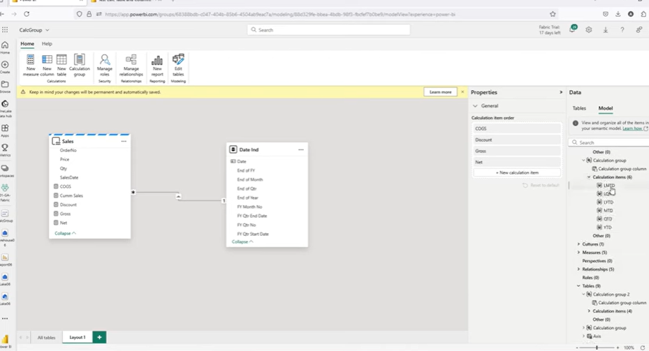
Calculation groups in Microsoft Fabric enable advanced measure management and dynamic time intelligence. In the current model, two distinct calculation groups are configured to enhance analytical flexibility.
Existing Calculation Groups in the Model
1. Measure Calculation Group
Contains key financial metrics used in reporting:
- COGS (Cost of Goods Sold)
- Discount
- Gross
- Net
2. Time Intelligence Calculation Group
Provides support for period-based calculations, including:
- MTD (Month-to-Date)
- QTD (Quarter-to-Date)
- YTD (Year-to-Date)
To extend time-based analysis further, additional calculation items have been added:
- LMTD (Last Month-to-Date)
- LQTD (Last Quarter-to-Date)
- LYTD (Last Year-to-Date)
These allow for side-by-side comparison of current vs. previous periods, enabling more complete performance tracking.
Grouping Measures by Period: Current vs. Previous
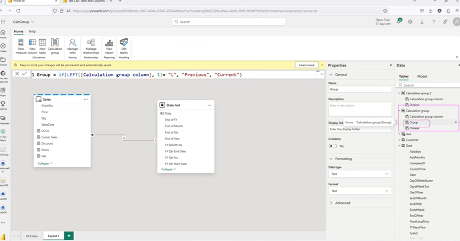
Distinguishing between current and prior period measures improves clarity in reports. A calculated column named Group is introduced to categorize each calculation item accordingly.
Creating the Calculated Column
A new column can be created within the calculation group table using the following DAX expression:
dax
CopyEdit
Group = IF(LEFT([Name], 1) = “L”, “Previous”, “Current”)
This logic evaluates the first character of each calculation item’s name:
- Items beginning with “L” are labeled Previous (e.g., LMTD, LYTD).
- All others are categorized as Current.
The column is committed to the model and becomes a part of the calculation group table. Although data preview is not available in the online modeler, the column is accessible in the reporting layer after refreshing the dataset.
Microsoft Fabric Vs Tableau: Choosing the Best Data Analytics Tool
A detailed comparison of Microsoft Fabric and Tableau, highlighting their unique features and benefits to help enterprises determine the best data analytics tool for their needs.
Creating a Dynamic Matrix Visual in Microsoft Fabric
With the Group calculated column now available in the model, it’s possible to enhance visualizations using hierarchical grouping. This section demonstrates how the Group column and calculation items work together to structure measures meaningfully in a matrix visual.
The objective is to show both Current and Previous period measures—organized under clearly labeled column headers—alongside a key dimension such as brand or product.
1. Refreshing the Model in the Report
To ensure that the newly added calculated column appears in the report environment:
- The semantic model must be refreshed.
- Once refreshed, the Group column becomes available in the fields pane, under the calculation group table.
This makes it usable as a grouping dimension for visuals such as matrix tables.
2. Configuring the Matrix Visual
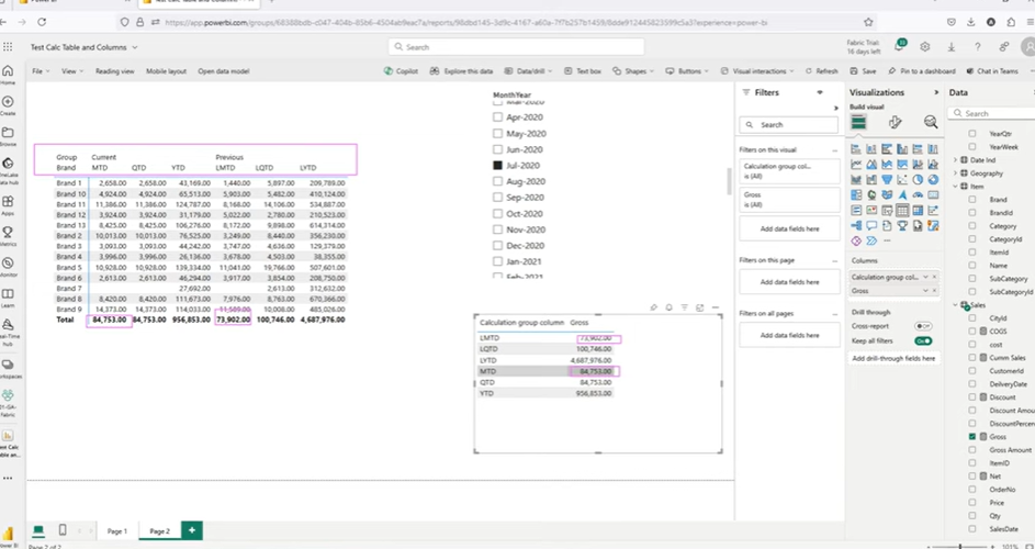
The Matrix visual is well-suited for showing hierarchical measure groupings. In this setup:
- Rows: Brand (from the Item table)
- Values: Gross (a pre-existing measure calculated as the sum of Gross Amount)
- Columns:
- First: The Group column (with values “Current” and “Previous”)
- Second: The Calculation Items (e.g., MTD, YTD, LMTD, LYTD)
This configuration results in column headers that organize time intelligence metrics under two primary groupings—Current and Previous. Each group contains its respective calculation items, such as:
- Current → MTD, QTD, YTD
- Previous → LMTD, LQTD, LYTD
This layered structure improves readability and aligns similar calculations under intuitive headers.
3. Considerations for Visual Accuracy
If only the Group column is added to the column area—without also including the Calculation Group—the visual may not return meaningful results. This occurs because the Group column itself depends on the calculation items being actively scoped in the visual.
To avoid this:
- Ensure that both the Group column and the calculation items are present in the column hierarchy of the visual.
- The matrix should expand to display the full depth of the grouping.
Once configured properly, the visual shows each brand with corresponding values for Gross under both Current and Previous time periods.
4. Validating the Results
To ensure the matrix is rendering accurate and expected values:
- Add a time slicer to filter the data—for example, by selecting “July 2020”.
- Observe how MTD and LMTD values are populated side by side for each brand.
- Confirm that totals and trends align with previous report outputs or known values.
In one example from the model:
- MTD Gross value: 84,753
- LMTD Gross value: 73,902
These values appear under the “Current” and “Previous” groupings respectively, validating that the grouping logic and time intelligence calculations are functioning correctly.
Best Practices for DAX Calculated Tables and Columns
The use of DAX calculated columns and tables in Microsoft Fabric’s semantic model introduces new modeling flexibility and analytical depth. However, to extract the most value—and avoid common pitfalls—it’s essential to follow established best practices and understand when and where to apply each feature effectively.
1. Avoid Direct Lake Dependencies in Calculated Tables
Calculated tables cannot reference Direct Lake tables. Attempting to use DAX to summarize or filter these sources will result in errors. Instead:
- Use Import mode tables where transformation or aggregation is required.
- Consider materializing intermediate tables upstream if needed.
2. Use ADDCOLUMNS for Efficient Inline Calculations
When creating calculated tables like a Date dimension, use the ADDCOLUMNS function to:
- Add multiple columns in one DAX expression.
- Maintain table logic and business semantics in a centralized definition.
- Avoid repeated steps across visuals or reports.
3. Establish Clear Sorting Rules for Time-Based Columns
Always ensure that display-friendly fields (e.g., “Month Year”) are paired with numeric sort keys (e.g., Month Year Sort). Apply “Sort by Column” in the model to enforce chronological order.
4. Classify Measures Using Simple Logic
For dynamic visuals, introducing a classification logic—such as “Current” vs. “Previous”—simplifies user navigation and improves report clarity. Calculated columns using expressions like LEFT([Name], 1) can be used effectively to automate this grouping.
5. Validate Calculated Column Scope in Visuals
Calculated columns that rely on other model elements (such as calculation groups) must be used within the correct visual context. Ensure all required fields are present to avoid blank or partial outputs.
6. Refresh the Model After Structural Changes
When calculated tables or columns are added in the model editor, changes won’t appear in the report view until the model is refreshed. Always validate structure updates before report consumption.
Practical Use Cases for DAX Calculated Tables and Columns
DAX calculated columns and tables in Microsoft Fabric offer meaningful advantages across real-world reporting and modeling challenges. Below are four common scenarios where these features can help deliver cleaner models, more dynamic reporting, and improved user experience.
1. Comparing Current and Prior Period Metrics
Business Challenge:
Executives often want to compare current performance (e.g., this month or quarter) with a previous period to track trends or seasonality.
How DAX Features Solve It:
- A calculation group is used to define both current (MTD, QTD, YTD) and prior period (LMTD, LQTD, LYTD) measures.
- A calculated column (Group) classifies each item as either “Current” or “Previous.”
- When used in a Matrix visual, this grouping enables clear segmentation of results across timeframes—making dashboards more intuitive and comparative analytics straightforward.
2. Building a Centralized and Reusable Date Table
Business Challenge:
Many organizations use inconsistent or repetitive date logic across models, leading to maintenance overhead and reporting inconsistencies.
How DAX Features Solve It:
- A calculated table is created using CALENDAR and ADDCOLUMNS to generate a complete and structured date dimension.
- The table is marked as a Date Table and joined with fact tables via standard relationships.
- Once defined, this reusable calendar ensures consistent sorting, labeling, and time intelligence across all reports that use the semantic model.
3. Creating Cleaner Report Layouts with Dynamic Headers
Business Challenge:
Matrix or table visuals can quickly become cluttered when multiple time-based KPIs are displayed. End users may struggle to differentiate between current and prior values.
How DAX Features Solve It:
- Using a calculated column like Group allows for hierarchical grouping in visuals.
- Time-based metrics are automatically organized under top-level headers such as “Current” and “Previous.”
- This design reduces cognitive load for viewers and enhances the overall readability of the report.
4. Simplifying Models and Centralizing Reusable Logic
Business Challenge:
Frequent repetition of the same calculated logic across measures increases the chance of errors and makes maintenance more complex.
How DAX Features Solve It:
- Use calculated tables to define reusable aggregations, classifications, or dimensions in one place.
- Logic is maintained centrally in the model instead of being duplicated in multiple visuals or report layers.
- This approach results in a cleaner, more maintainable semantic model with consistent logic across all downstream analytics.
Accelerate Your Data Transformation with Microsoft Fabric!
Partner with Kanerika for Expert Fabric implementation Services.
Why Kanerika is Your #1 Choice for Data Modernization Services
As a leading provider of data and AI solutions, Kanerika recognizes the need for businesses to transition from legacy systems to modern data platforms. Upgrading outdated infrastructure enhances data accessibility, improves reporting accuracy, enables real-time insights, and lowers maintenance costs. With modern platforms, businesses can harness advanced analytics, cloud scalability, and AI-powered decision-making to stay ahead in a competitive landscape.
However, manual migration processes can be complex, time-intensive, and prone to errors, often disrupting critical business operations. Even a minor mistake in data mapping or transformation can lead to inconsistencies, historical data loss, or extended system downtime.
To address these challenges, Kanerika has developed custom automation solutions that streamline migrations across multiple platforms with precision and efficiency. Our automated tools ensure seamless transitions from SSRS to Power BI, SSIS and SSAS to Fabric, Informatica to Talend/DBT, and Tableau to Power BI, minimizing manual effort while preserving data integrity.
Partner with Kanerika for a seamless, automated, and risk-free data modernization experience.
FAQs
Can DAX calculated tables reference Direct Lake tables?
No.
Calculated tables cannot reference tables stored in Direct Lake mode. Any attempt to use a Direct Lake table in a DAX expression such as SUMMARIZE or SELECTCOLUMNS will result in an error. Only tables in Import mode or created within the semantic model can be used in calculated table logic.
Why is the “New Column” button disabled for some tables?
The “New Column” option is only enabled for tables that are part of the semantic model and are in Import mode.
If a table is sourced via Direct Lake, the option to add a calculated column will not appear. In contrast, calculated groups or other imported tables will allow new columns to be added.
What is the purpose of marking a table as a Date Table?
Marking a table as a Date Table ensures compatibility with DAX time intelligence functions.
When this designation is applied, Power BI and Fabric can correctly evaluate functions like TOTALYTD, DATESMTD, or SAMEPERIODLASTYEAR. It also enables features like continuous date axes and accurate date filtering in visuals.
How does the “Group” column improve reporting?
The Group column categorizes calculation items into logical groups such as Current or Previous.
This classification supports cleaner report visuals by allowing hierarchical column headers in Matrix visuals. It also simplifies filtering and makes comparisons between time periods more intuitive for report consumers.
Can calculated columns be used on their own in visuals?
Not always.
In certain scenarios—such as grouping calculation items—the calculated column depends on the calculation group itself being part of the visual’s context. Adding only the column without its related group may result in blanks or unexpected behavior. Always ensure both are scoped correctly in visuals.
How do I ensure that month names appear in chronological order?
String-based month names (e.g., “Jan 2020”, “Feb 2020”) must be paired with a corresponding numeric sort column, such as Month Year Sort.
Apply the “Sort by Column” setting in the semantic model to sort the display column using the numeric one. This ensures accurate chronological order in visuals, slicers, and filters.


