In 2025, Power BI continues to solidify its position as a leading business intelligence tool, with over 97% of Fortune 500 companies utilizing its dashboards to make informed decisions. This widespread adoption underscores Microsoft’s commitment to enhancing data analytics capabilities across industries.
A key factor in Power BI’s success is its regular monthly updates, introducing features that refine data visualization and user interaction. The October 2024 update is no exception, bringing significant improvements to marker customization in line, scatter, and anomaly charts.
These enhancements provide users with greater control over marker attributes, including shape, size, rotation, color, transparency, and borders. Such flexibility allows for more precise data representation, aiding in clearer trend analysis and storytelling.
In this blog, we’ll delve into the specifics of these marker enhancements, providing a comprehensive guide on how to leverage these new features to elevate your Power BI reports.
What Are Marker Enhancements in Power BI?
Marker Enhancements in Power BI refer to the new customization options added to markers—those small shapes or points that show up on the line charts, scatter plots, and anomaly visuals. These markers help users spot key data points, trends, or changes across a timeline or category.
Before October 2024, marker styling was basic. You could only switch them on or off and had very limited control over how they looked. With the latest update, Microsoft has opened a full panel of styling options that let you tweak markers in more detail.
Move Beyond Legacy Systems and Embrace Power BI for Better Insights
Partner with Kanerika Today.
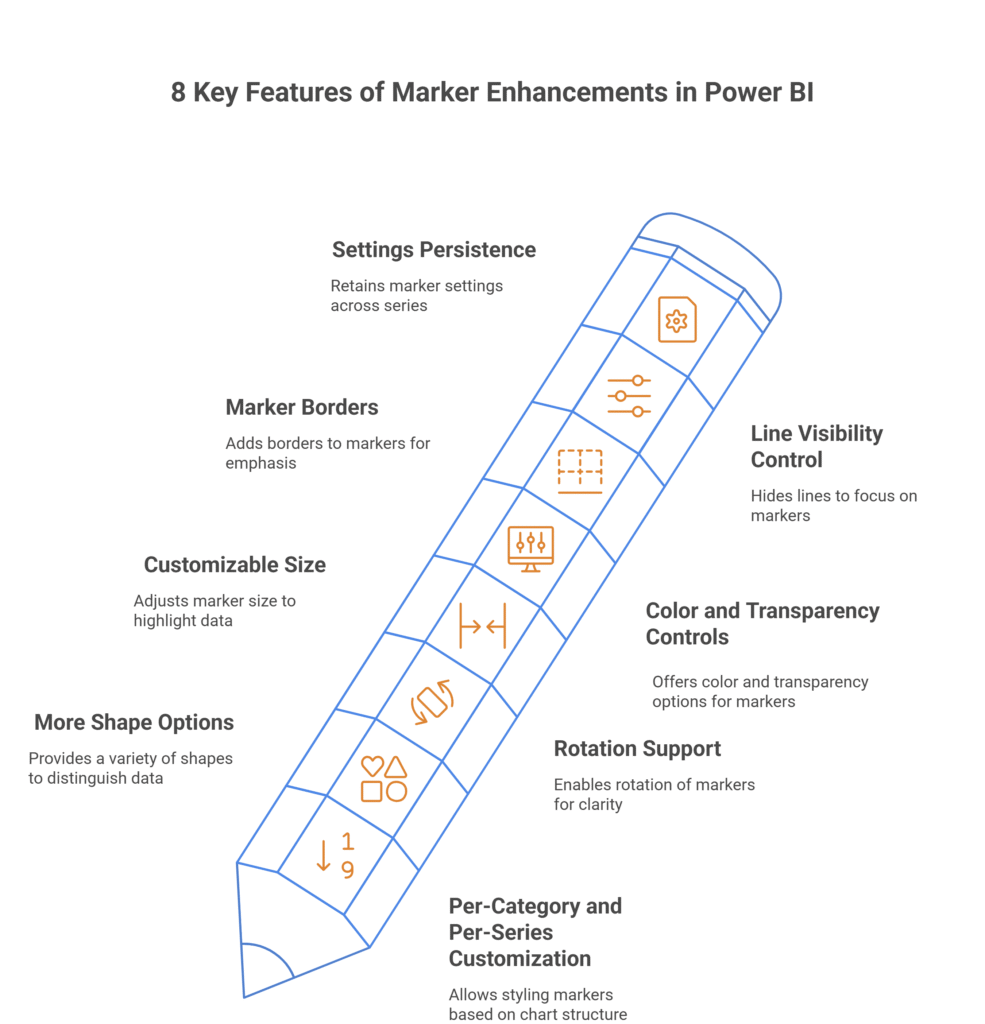
8 Key Features of Marker Enhancements in Power BI
This feature added several new options that give you more control over how markers look and behave in your visuals. Here’s a rundown of the most important features:
1. Per-Category and Per-Series Customization
You can now customize markers based on either:
- Category level – Useful when your chart doesn’t have a legend. Each x-axis value (like months or product names) can have its own marker style.
- Series level – When your chart includes a legend, each data series can be styled separately.
This flexibility means you can style data points exactly how you need them, depending on how your chart is structured.
2. More Shape Options
You’re no longer stuck with default circles. Now you can choose from multiple shapes such as:
- Triangle
- Square
- X
- Diamond
- Plus sign
And more. This helps in clearly distinguishing between different data series or categories.
3. Rotation Support
Except for the circle, all shapes now support rotation. For example, a triangle rotated 90 degrees can point up or down depending on the message you want to convey. This is useful when overlapping lines make markers hard to distinguish.
4. Customizable Size
You can adjust the marker size globally or for individual series or categories. This makes it easy to highlight specific data points or reduce clutter in busy charts.
5. Color and Transparency Controls
Markers can now be styled with:
- Any fill color
- Adjustable transparency, from fully visible to completely invisible
You can use transparency to tone down less important data points or hide markers altogether without deleting them.
6. Marker Borders
This is a new addition. You can now add borders to markers and control:
- Border color
- Border width
- Border transparency
Borders help make markers stand out, especially when using similar colors across series.
7. Line Visibility Control
You can now reduce a line’s thickness to zero, effectively hiding the line and showing only the markers. This is useful when you only want to show individual data points without any connecting lines.
8. Settings Persistence
If you apply marker settings before adding more series, Power BI retains those changes. This is handy when you want to lock in a design before expanding your visual.
Steps to Enable Marker Enhancements in Power BI
Before customizing markers, you need to know where the options live in Power BI’s interface.
Here’s a quick walkthrough to help you get started.
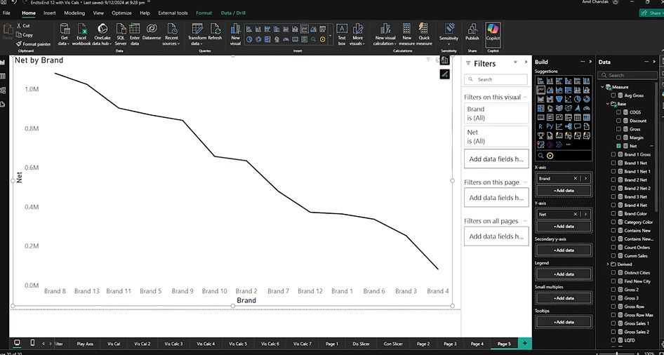
1. Add a Visual to Work With
Start by adding a visual where markers apply — such as a line chart, scatter plot, or anomaly detection visual.
Example:
Create a line chart using a single measure like Net Sales and drop it onto a new page in Power BI Desktop.
2. Open the Format Pane
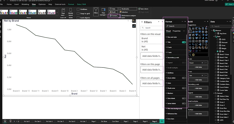
This is where you’ll access all customization settings.
- If the Format pane isn’t showing:
- Go to the top ribbon and click on “View”.
- Check the box next to “Format Pane” to enable it.
3. Locate the Marker Settings
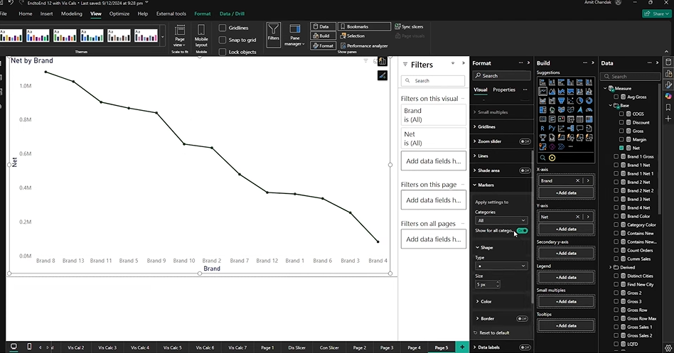
Once your chart is selected:
- Scroll through the Format pane.
- Look for the “Markers” section under “Lines” or “Series.”
- Turn the toggle ON to activate marker options.
4. Start Customizing
After enabling markers:
- You’ll see options for shape, size, color, border, rotation, and more.
- These settings apply either to:
- All markers in the chart, or
- Specific categories or series, depending on how your data is structured.
We’ll cover how each of those options work in the next sections, with both single-series and multi-series examples.
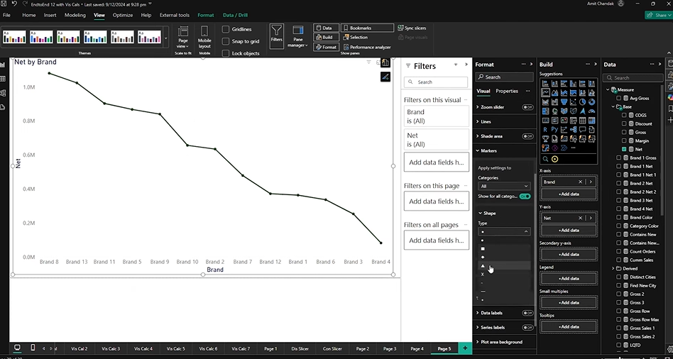
How to Customize Markers in Line Charts in Power BI
Once you’ve enabled markers, you can start making changes to how each data point looks in your line chart. The changes you make can apply to the whole chart, or just specific parts—like a single data series or an individual category on the x-axis.
Let’s walk through two key use cases: single-series and multi-series line visuals.
1. Line Chart with a Single Series
Start by creating a basic line chart with one measure (e.g., Net Sales) and no legend. This setup gives you category-level control, meaning you can style each data point along the x-axis independently.
Here’s what you can do:
Shape and Size
- Choose from several marker shapes (triangle, square, diamond, etc.).
- Adjust the size using a simple slider or number input.
Rotation
- Rotate most shapes (except circles) to tilt them for a better visual distinction.
- For example, rotating a triangle 90 degrees makes it point upward or downward.
Color and Transparency
- Pick any color for the marker fill.
- Set transparency to tone down or completely hide the marker.
- Tip: Setting transparency to 100% makes the marker invisible without deleting it.
Border Styling
- Add a border to the marker.
- Customize its color, thickness, and transparency.
- This helps markers pop out more—especially when your marker fill color is similar to the chart background or line color.
Category-Specific Styling
You can also target a single category (e.g., “Brand Eight”) and apply a unique marker style to just that data point. This is handy when you want to highlight a specific point in a time series or a key outlier.
2. Line Chart with Multiple Series
Next, try adding another measure (e.g., Gross Sales) to the same line chart. Now the chart includes a legend, and your marker settings switch to series-level control.
Here’s how it works:
- You can apply different marker styles to each series.
For example, make Net Sales use triangles and Gross Sales use squares.
- Each series can have its own color, size, and border settings.
- Any category-level styling done earlier remains intact for the original series.
So if you styled “Brand Eight” before adding a second series, that customization is preserved.
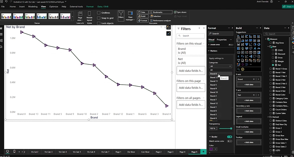
This lets you control the look of each series independently; while also maintaining any custom work you’ve already done on specific data points.
3. Show Markers Without the Line
If you want to highlight data points without the connecting line, just reduce the line width to zero in the formatting pane. This leaves only the markers visible—perfect for when you want a dot chart or need to avoid clutter from overlapping lines.
You can even apply this trick to only one of the series (e.g., show markers only for Gross Sales, but leave the line visible for Net Sales).
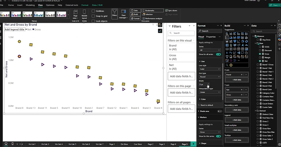
A Simple Guide to Using Markers Without Lines in Power BI
Sometimes a line can get in the way. Whether you’re trying to simplify your chart, reduce visual clutter, or focus on just the data points, Power BI gives you a way to remove the lines and keep only the markers.
This trick works especially well when:
- You’re working with dense or overlapping data
- You want to highlight individual values
- Or you’re aiming for a clean, minimalist visual
Here’s how to do it step by step.
Step 1: Set Up Your Line Chart with Markers
Make sure you have a chart ready with markers already enabled. If you haven’t done that:
- Create a line chart with at least one measure (like Net Sales)
- Open the Format pane
- Turn on the Markers option under the visual settings
- Adjust the marker shape, color, size, or border if needed
Now you’re ready to control the lines.
Step 2: Remove the Line While Keeping the Markers
Follow these simple actions:
- Still inside the Format pane, find the Lines section
- You’ll see a setting for Line width
- Set the line width to 0 (zero): This hides the line completely but leaves your markers untouched
If you have multiple series:
- You can remove the line for only one series, or
- Set all series to have zero-line width if you want a full marker-only chart
Example Use Case
You have two data series:
- Net Sales – keep the line and triangle markers
- Gross Sales – hide the line, show only square markers
This setup gives your audience an easy way to compare both, without crowding the visual.
How to Customize Markers for Legend-Based Series
When your line chart includes a legend field (for example, different product categories, departments, or customer segments), each line in the chart represents a separate group. Power BI allows you to style the markers for each series independently, giving you a lot more flexibility.
This is especially useful when:
- You want to visually separate lines that represent different business units or categories.
- You need to highlight specific groups for comparison.
- You want to make each line more recognizable without relying on just color.
Here’s how to set it up and apply changes step by step.
Step 1: Create a Line Chart with a Legend
- Add a line chart to your Power BI report.
- Drag a time field (e.g. Month-Year) onto the X-axis.
- Drag a numeric measure (e.g. Net Sales) onto the Y-axis.
- Now, drag a field like Product Category into the Legend section.
Each category will now be shown as a separate line in the chart.
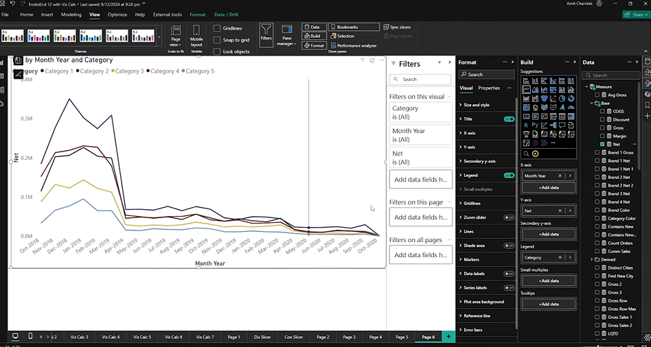
Step 2: Customize Marker Settings Per Series
Once your chart has multiple lines based on the legend:
- Open the Format pane.
- Go to the Markers section.
- Turn on markers for all series using the top toggle.
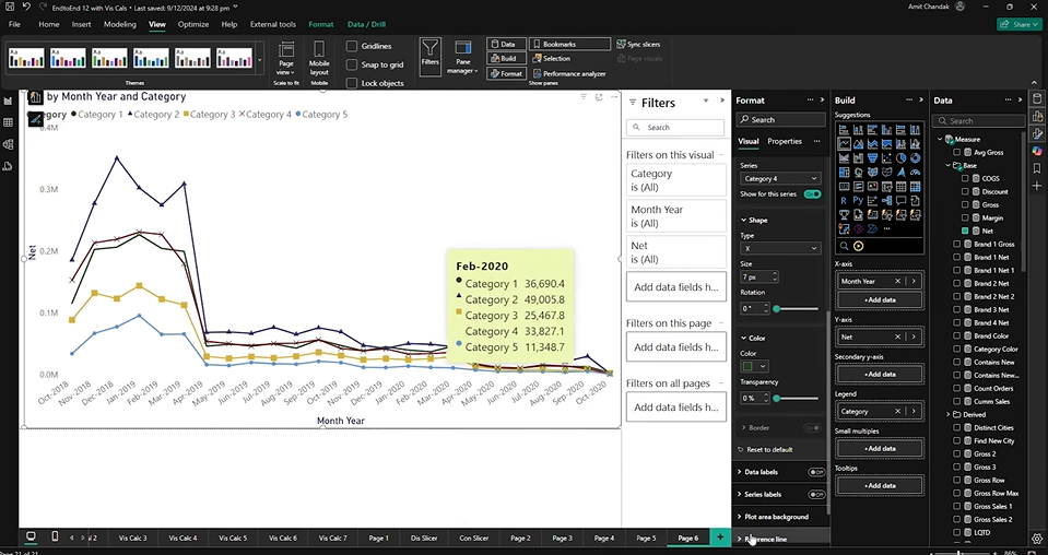
Now you can apply changes to each series individually:
For example:
- Category 1 – Hide its markers entirely by turning off the toggle.
- Category 2 – Set marker shape to triangle, make size larger.
- Category 3 – Use squares, change color to blue, increase border width.
- Category 4 – Choose an X shape, color it violet, and rotate it slightly.
All these changes will only apply to the selected category or series in the legend, giving you fine control over how each group appears.
Tips for Working with Legend Series
- Stick to distinct marker shapes when multiple lines cross over each other.
- Increase marker size slightly for the series that matters most.
- Use rotation to make similar shapes (like triangle vs diamond) easier to tell apart.
- Color coding helps, but shape and size are more reliable for clarity—especially for color-blind viewers.
Customizing Markers in Scatter Charts in Power BI
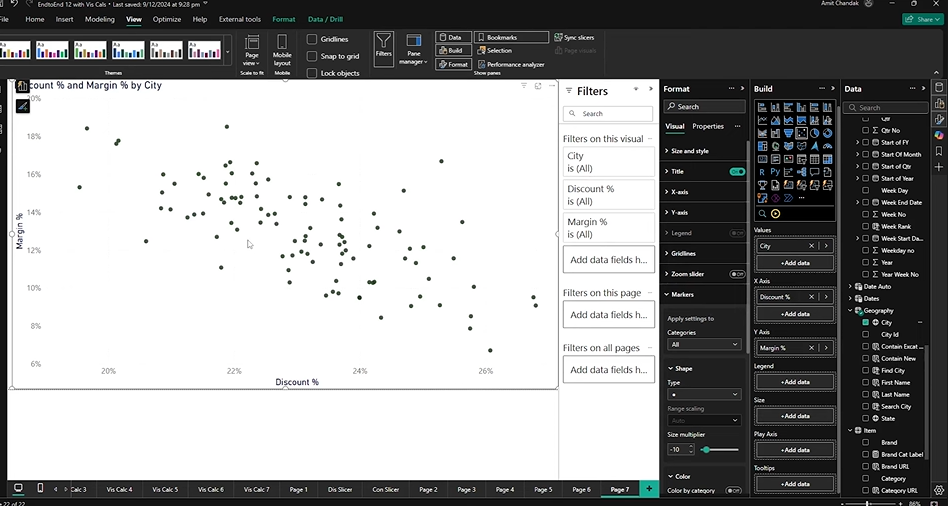
Scatter charts are built entirely around markers. Each point on the chart represents a combination of two measures (e.g. margin % and discount %) and is often grouped by a category like city or customer.
With the updated marker controls, scatter charts now give you more ways to highlight specific data points, emphasize differences, and style each category uniquely—without having to use complex tricks or custom visuals.
Step 1: Create a Scatter Chart
- Add a scatter visual to a new page in your report.
- For the X-axis, choose a field like Discount %.
- For the Y-axis, choose another field like Margin %.
- Drag a categorical field like City into the Details section.
- Optionally, use a third measure (e.g. Gross Sales) for the Size field if you want dynamic sizing.
At this point, you’ll see all data points plotted as dots, usually one for each city.
Step 2: Style All Markers or Individual Categories
Open the Format pane and go to the Markers section. You now have two main choices:
Option A: Style All Markers at Once
- Increase the overall marker size to improve readability.
- Choose a new shape (square, diamond, triangle, etc.).
- Adjust color, border, or transparency for all points.
Option B: Style a Specific Category
Let’s say you want to highlight Los Angeles in your chart.
- In the marker formatting panel, look for Category dropdown.
- Select “Los Angeles” from the list.
- Apply custom styling:
- Chage shape to triangle
- Set a distinct color (e.g. red or violet)
- Adjust border color and width
- Set rotation for a more noticeable effect
This custom styling applies only to Los Angeles. All other cities retain the general settings unless you individually style them too.
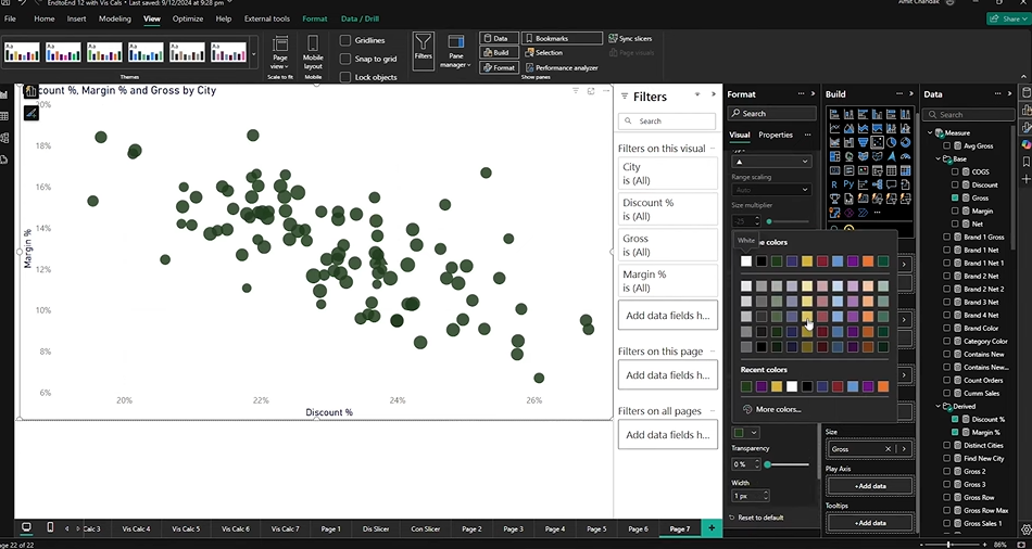
Dynamic Sizing Based on a Measure
Scatter visuals let you control the size of each marker using a measure.
For example:
- Drag Gross Sales into the Size field.
- Power BI now sizes markers based on that value.
If the markers become too large:
- Return to the Format pane → Markers
- Adjust the size scale range (e.g., lower max size to reduce clutter)
This gives you a good mix of visual encoding—position, size, and shape—all tailored to the data.
Combine Styling Techniques
For maximum control, you can:
- Show only specific cities using transparency
- Use rotation to call out unique data points
- Combine size, color, and borders to differentiate high-value or high-risk items
In short, scatter charts benefit the most from these marker enhancements because they’re 100% marker-based to begin with. You now have full control to turn them into sharp, readable, and purposeful visuals.
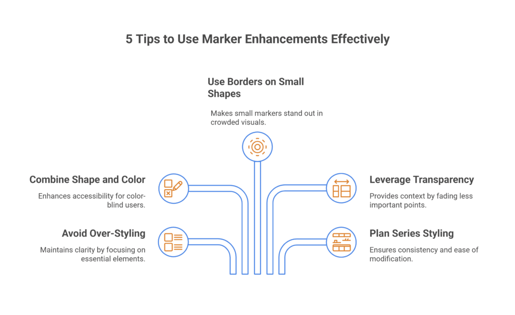
5 Tips to Use Marker Enhancements Effectively
- Avoid over-styling: Just because you can change everything doesn’t mean you should. Stick to a clear visual logic—use shape, color, or size to highlight what matters most.
- Combine shape and color for better accessibility: This helps users who might have trouble distinguishing colors. A triangle and a square are easier to tell apart than two shades of blue.
- Use borders on smaller shapes: When using small-sized markers, a contrasting border helps them pop—especially in crowded visuals.
- Leverage transparency for context: Fade less important points instead of deleting them. This keeps the full picture in view while guiding the audience’s attention.
- Plan series-level styling before adding more data: If you want unique settings for one series or category, it’s easier to style it before adding more measures or legend fields.
Stay Ahead of the Competition with Kanerika’s Advanced Analytics Solutions
Kanerika is a premier data and AI solutions company that helps businesses unlock the full potential of their data with cutting-edge analytics solutions. Our expertise enables organizations to extract fast, accurate, and actionable insights from their vast data estate, empowering smarter decision-making.
As a certified Microsoft Data and AI solutions partner, we leverage the power of Microsoft Fabric and Power BI to develop tailored analytics solutions that solve business challenges and optimize data operations for better efficiency, performance, and scalability.
Whether you need real-time insights, AI-driven analytics, or advanced BI capabilities, Kanerika delivers customized solutions that drive growth and innovation. Our deep expertise in data engineering, visualization, and AI ensures that your business stays ahead in an increasingly data-driven world.
Partner with Kanerika today and transform your data into a strategic advantage for long-term success!
FAQ
What are the enhancements of markers in Power BI?
The enhancements to the markers provide us with a broader toolkit to emphasize specific data points and series. The updates allow us to customize markers for individual categories as well as for the entire series, opening up new opportunities to highlight trends, make comparisons, and showcase key insights.
Where can I find marker settings in Power BI?
You can find them in the Format pane under the Markers section. Make sure markers are turned on for your visual. In newer versions, look under “Show for all series” for the main toggle.
Can I customize markers for just one data point?
Yes. If your chart doesn’t use a legend (i.e., it’s based on categories), you can style each data point on the x-axis separately—like setting a different shape or color for just “March” or “City A.”
Can I use different marker shapes for each series?
Yes. When your chart includes a legend (like multiple measures or categories), you can assign unique marker shapes, colors, and sizes to each series.
How do I remove the line and keep only markers?
Set the Line width to 0 in the Format pane. This hides the connecting line while leaving your markers visible. It works for all series or just one.
What’s the difference between category-level and series-level styling?
Category-level: You can customize markers for individual x-axis values (e.g., one month or one product).
Series-level: You style an entire series when a legend is used (e.g., Net Sales vs. Gross Sales).


