Power BI has been named a Leader in Gartner’s Magic Quadrant for Analytics and Business Intelligence Platforms for five consecutive years.
That recognition isn’t just a badge — it reflects how widely Power BI has been adopted across industries as a trusted platform for business reporting and analytics. With its tight integration into Microsoft’s ecosystem and regular monthly updates, Power BI continues to grow in popularity among data professionals, analysts, and business users alike.
Power BI introduced a feature that’s both simple and surprisingly effective: Small Multiples for the new Card Visual. For anyone who builds dashboards that track KPIs across multiple categories — like region, brand, or customer segment — this feature removes a common pain point. Instead of creating multiple visuals or setting up slicers, you can now repeat the card automatically across categories in a clean, compact format.
In this blog, we’ll break down what this feature brings and why it might be a useful addition to your Power BI reports.
What Are Small Multiples in the New Card Visual?
Small multiples in Power BI’s new card visual let you display the same measure across different values of a category — all within a single visual. Instead of creating separate visuals for each brand, product, or region, you can now set up one card visual and let Power BI repeat it automatically based on the field you choose. Each card represents one value from that field and displays the same metric, making comparisons quick, consistent, and clean.
This feature helps reduce clutter, improves layout efficiency, and offers a more structured way to look at category-level metrics — especially useful in dashboards tracking KPIs across segments.
Key Features of Small Multiples in the New Card Visual
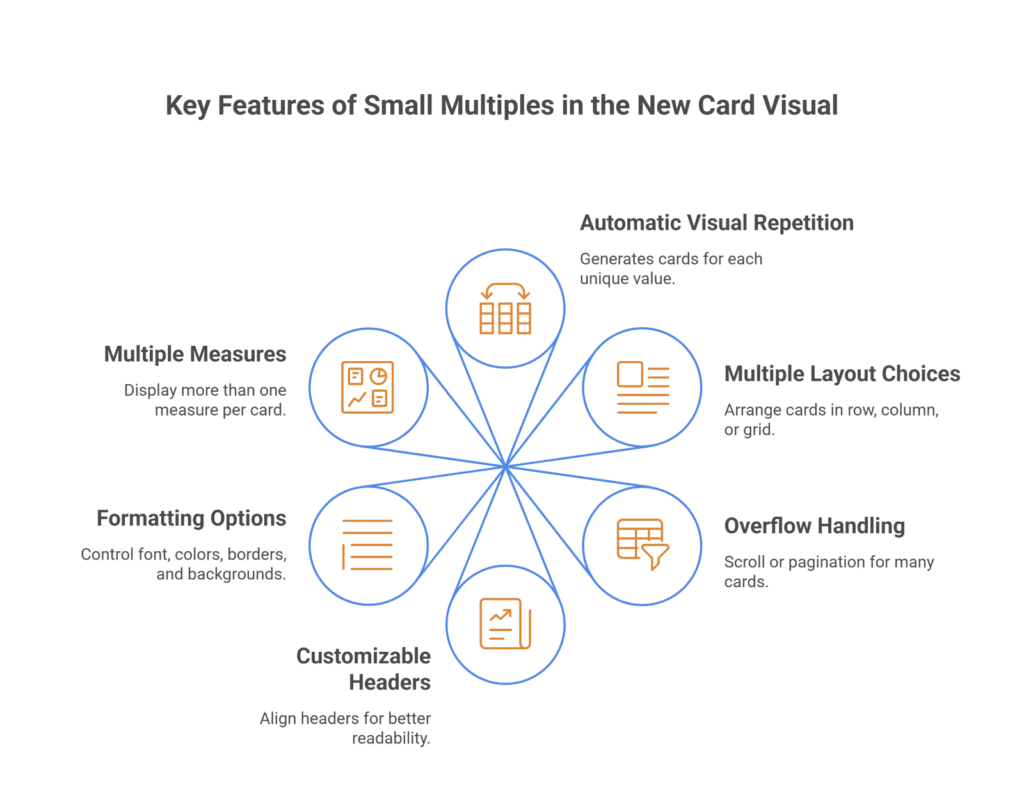
1. Automatic Visual Repetition by Category
Once you drag a categorical field (like Brand or Region) into the small multiples section, Power BI generates a separate card for each unique value — no need to build multiple visuals manually.
2. Multiple Layout Choices
You can choose how the repeated cards are arranged: in a single row, a single column, or a grid layout. Grid mode allows you to define the number of rows and columns based on what fits your report design.
3. Overflow Handling with Scroll or Pagination
If there are more cards than can fit in the visual space, you can choose between continuous scrolling or pagination. Both vertical and horizontal paging options are available depending on your layout.
4. Customizable Headers for Better Clarity
Headers can be aligned vertically or horizontally and placed at the top or on the left side of each card. This flexibility helps maintain readability depending on the number of cards and layout used.
5. Detailed Formatting Options
You have control over font styles, label colors, and padding. You can also adjust borders — changing width, color, and transparency — and even add background colors or images if needed.
6. Support for Multiple Measures
The new card visual also allows you to display more than one measure in each card. For example, you can show both Net Sales and Gross Margin per product, with the visual adjusting automatically to fit the content.
Steps to Enable Small Multiples in the New Card Visual
Before you can use small multiples with the new card visual, the feature needs to be manually turned on — it’s part of Power BI’s preview features. Enabling it takes just a minute and only needs to be done once per Power BI Desktop installation.
Step 1: Open Power BI Desktop
Launch Power BI Desktop on your machine. To access the latest preview features, make sure you’re running the most recent version. You can check this by going to Help > About and comparing your version with the latest release on Microsoft’s official Power BI blog.
Step 2: Go to the Options Menu
In the top-left corner, click on File, then go to Options and settings, and choose Options. This will open the settings window for your Power BI Desktop.
Step 3: Find Preview Features
On the left side of the Options window, scroll to the section titled Preview features. This area lists features that are still being tested or rolled out gradually.
Step 4: Enable the New Card Visual
In the list of preview features, look for “New card visual”. Check the box next to it to turn it on. This specific visual supports the small multiples functionality — the classic card visual does not.
Step 5: Restart Power BI Desktop
After enabling the feature, click OK to save your settings. Power BI might not show the new visual until you restart the app, so close it and reopen it to make sure everything loads correctly.
What Happens After You Enable It
Once enabled, you’ll see an updated card visual in your Visualizations pane — it looks similar to the old one but offers more layout and formatting options. From here, you can start building visuals with small multiples by dragging a category field (like Region, Product, or Brand) into the new small multiples section of the visual.
If the new card visual doesn’t appear even after restarting, double-check your Power BI version or try re-enabling the feature. In some cases, updating to the latest monthly release is required before preview features become available.
Take Your Business to the Next Level with Innovative Power BI Solutions!
Partner with Kanerika today.
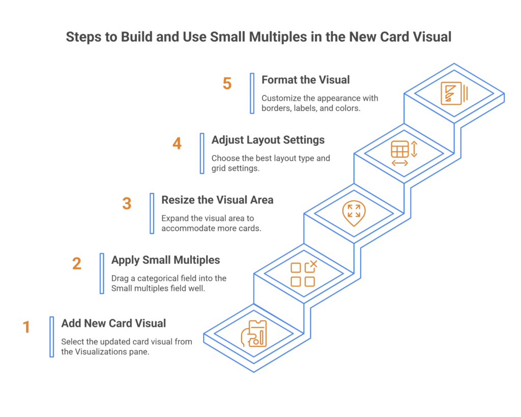
Steps to Build and Use Small Multiples in the New Card Visual
Once the new card visual is enabled, using small multiples is simple — but knowing the layout options and how to manage space can make a big difference in how clean your report looks. This section walks you through adding the visual, applying small multiples, and adjusting basic settings for the best result.
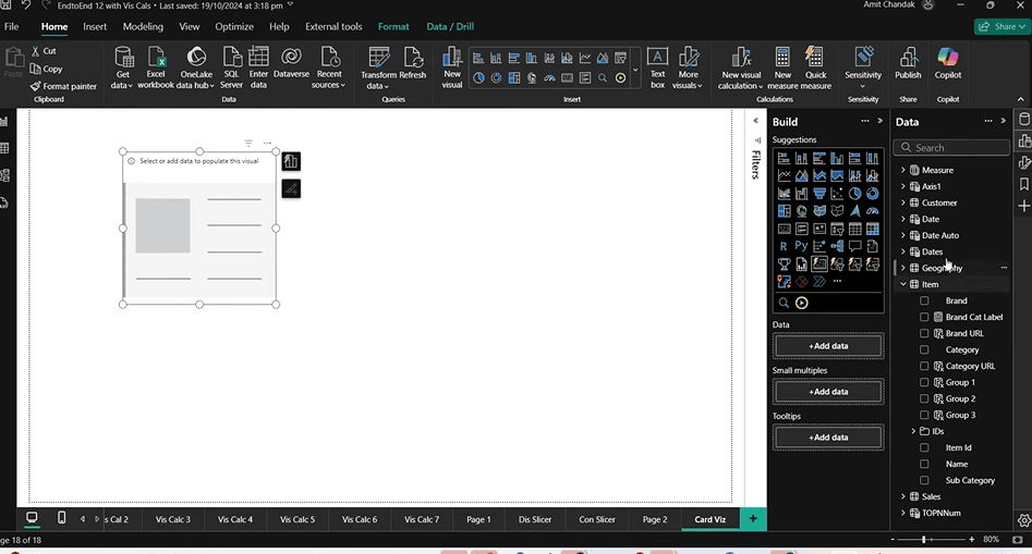
1. Add the New Card Visual to Your Report
Open your Power BI report or create a new page. From the Visualizations pane, select the updated card visual. It looks similar to the original but includes more fields — including one labeled small multiples.
Drag a measure, like Net Sales or Revenue, into the Values field of the visual. This will display a single card by default.
2. Apply Small Multiples
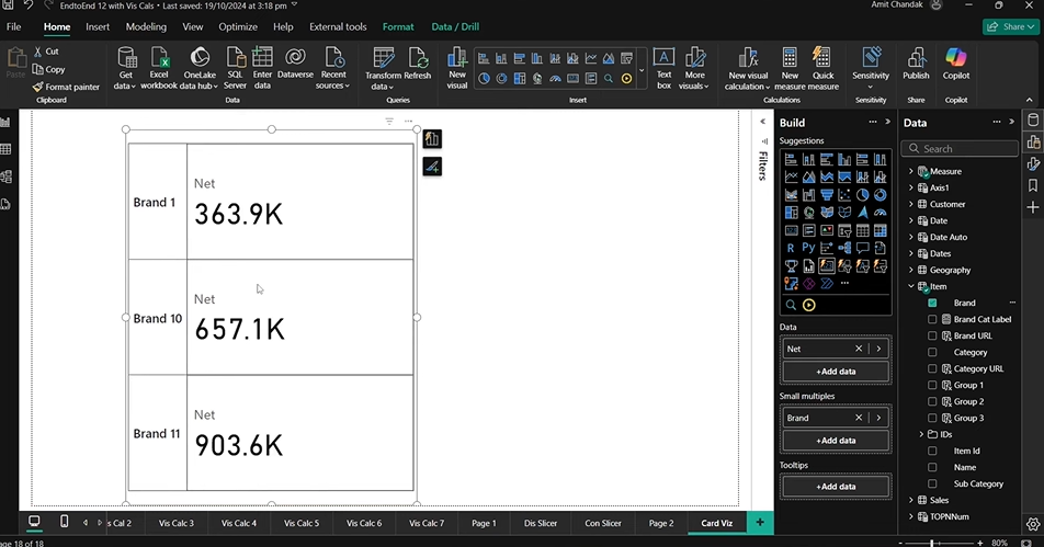
To turn it into a multi-card visual, drag a categorical field (like Brand, Region, Customer Type, etc.) into the small multiples field well. Instantly, Power BI will create one card per unique value from that field — arranged according to the default layout.
Each card shows the same measure, filtered by one category value. For example, if you’re using “Brand,” you’ll see one card for each brand, all showing the same metric (e.g., Net Sales).
3. Resize the Visual Area
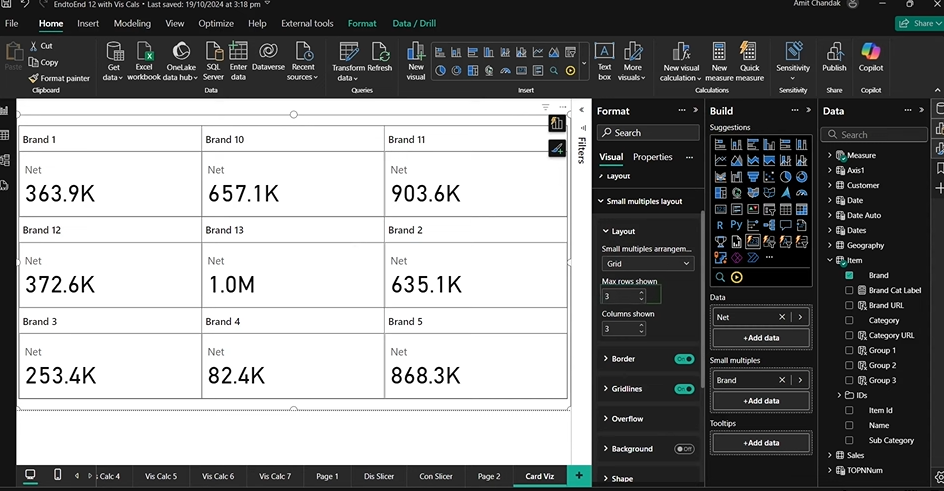
Depending on how many categories you have, the cards may look squeezed or cut off. Expand the visual area to give it more room. This is especially important if you’re working with many values or planning to display more than one metric per card.

4. Adjust Layout Settings
Open the Format pane and look under the Small multiples section. Here you’ll find layout controls:
- Layout type: Choose between Single column, Single row, or Grid
- Grid settings: Manually set the number of rows and columns
- Spacing and padding: Adjust gaps between cards for a tighter or looser fit
Choose a layout that works best with your data and available space.
5. Format the Visual
Use the Formatting options to clean up the look:
- Add or remove borders
- Show or hide labels and callout values
- Apply background colors or images
- Set font size, alignment, and transparency
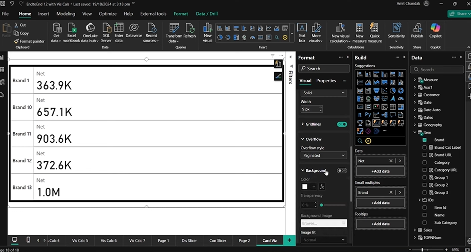
If the number of cards is too large to display at once, use overflow settings to switch between scrolling and pagination.
How to Create a Quadrant Chart in Power BI
Discover how to build interactive Quadrant Charts in Power BI to compare performance, analyze trends, and visualize key metrics.
Small Multiples Layout Options in Power BI
The layout settings control how your repeated cards are arranged on the page — and getting this part right is important. A well-chosen layout makes your report easier to read, while a poor one can quickly make it feel cramped or disorganized. Power BI gives you flexible options for controlling how small multiples are displayed within the card visual.
1. Single Column Layout
This layout stacks each card vertically, one below the other. It works well when:
- You’re working with fewer category values
- Your report design is more vertical in nature
- You expect users to scroll down to explore data
This layout also gives you more control over the width of each card, especially when only one or two measures are being displayed.
2. Single Row Layout
In this mode, all cards are displayed in a horizontal line. It’s useful when:
- You want to highlight comparisons across categories side by side
- Your page layout has more horizontal space than vertical
- You’re using fewer values or a short list of categories
Keep in mind, single-row layouts may need width adjustments if the cards start to overflow the page.
3. Grid Layout
Grid layout is the most flexible option, allowing you to define the exact number of rows and columns. For example:
- A 3×4 grid (3 rows, 4 columns) will display 12 cards on one page
- A larger grid like 4×5 can show 20 cards, ideal for dense comparisons
Grids are especially useful when you want to make the most of your visual space and show a larger set of categories at once. You can set these values manually under the layout options in the Format pane.
Formatting and Styling Small Multiples in the Card Visual
Once your small multiples layout is set, the next step is formatting — adjusting borders, backgrounds, fonts, and labels to make the visual easier to read and more consistent with your report’s overall look. Power BI offers a good set of styling options in the new card visual, giving you full control over both the card content and how each multiple is presented.
1. Borders and Grid Lines
You can choose to add borders around each card to separate them visually. The border color, thickness, and transparency can all be customized. If you’re going for a clean, minimal look, you might skip borders altogether. But if you have many cards close together (like in a grid), subtle borders can help prevent visual overlap.
Grid lines are also available, but it’s usually best to pick either borders or grid lines — not both. Using both at once can make the visual feel too busy.
2. Background Options
Under the formatting settings, you can choose:
- A background color for each card (use light tones to avoid overpowering the data)
- A background image, which is more useful for branded dashboards or custom report themes
You can turn the background on or off and adjust its transparency depending on the visual’s purpose.
3. Fonts, Callouts, and Labels
You have full control over:
- Font style and size for the measure values
- Callout value visibility — helpful if you want to hide the number and only show the label or vice versa
- Label formatting, including font color, alignment, and spacing
If your visual only shows one measure, you might choose to hide the label for a cleaner look. But when using multiple measures, labels become important to distinguish which number represents what.
4. Rounded Corners and Shape Adjustments
The new card visual allows for round corners, which can soften the look of your report. This is a purely stylistic choice, but when used properly, it helps the visual blend better with other modern visuals and themes.
Working with Headers in Small Multiples
Headers in small multiples are more than just labels — they guide how users interpret the category breakdown. Power BI lets you customize both the orientation and position of headers, depending on how your layout is structured.
Once your cards are arranged in a single row, column, or grid, go to the Format pane, and expand the small multiples header section.
1. Orientation Settings
You can set the orientation to:
- Vertical – Headers will appear rotated, which often works better for narrow column layouts.
- Horizontal – Best suited for row-based layouts or when you want the header to run left-to-right.
Choosing the right orientation helps maintain clarity, especially when space is tight or when working with long category names.
2. Position Options
Power BI gives you two positions to place your headers:
- Top – Headers are shown above each card. This is often used in row or grid layouts where horizontal space is limited.
- Left – Headers are aligned to the left of each card, ideal for stacked column layouts or vertical scrolling setups.
Each option works better in different layout scenarios. For instance:
- If you’re using a single row layout, top-positioned headers feel more natural.
- If you’re using a single column layout, left-positioned headers improve readability.
As with most formatting in Power BI, it’s worth testing both options and previewing how your report looks, especially if you’re dealing with long lists or dense grids.
Using Multiple Measures in Small Multiples
One of the useful additions in the new card visual is the ability to display more than one measure inside each card. This makes small multiples even more valuable — especially when you’re comparing multiple metrics across the same category, like revenue and profit for each region or cost and margin per product.
Setting it up is straightforward, but there are a few things to keep in mind for the best visual output.
1. Adding Multiple Measures
To use multiple measures, simply drag more than one field into the Values area of the card visual. For example, you might add:
- Net Sales
- Gross Profit
Power BI will automatically adjust the card layout to fit both values. If space is limited, it may stack them vertically or compress the layout depending on your visual settings.
2. Switching Layout Mode
When using multiple measures, the layout of the card itself (not the small multiples) becomes important. In the Format pane, look under Card layout. You can choose between:
- Card: Displays each measure in its own section with callout styling.
- Table: Shows all measures in a table-like format, useful for tighter layouts or when displaying many values.
You can also adjust the card position layout — for example, switching from single row to single column — depending on what looks best and how many values you’re working with.
3. Label Visibility and Readability
When displaying multiple measures, it’s a good idea to turn on labels so users can clearly identify what each value represents. If labels are off, numbers may be hard to interpret, especially in tighter grid layouts.
You can customize label color, font size, and position to make the visual easier to scan.
Real-World Use Cases for Small Multiples in the New Card Visual
The small multiples feature isn’t just about making visuals look cleaner — it’s about saving time and improving clarity in reports where repeated comparisons are common. If you’re wondering where this fits into your reporting workflow, here are some examples based on everyday scenarios across sales, marketing, operations, and finance.
1. Sales Performance by Region or Territory
Instead of building individual cards for each region, you can now create one visual that repeats automatically:
- Show Total Sales, Target vs Actual, or YoY Growth per region
- Quickly compare which locations are underperforming or exceeding targets
- Great for sales dashboards where regional managers need a clear view of their zones
2. Product Category or Brand Breakdown
Track KPIs like Revenue, Profit Margin, or Inventory Turnover by product category:
- Each card can represent a category or sub-brand
- Add multiple measures to show net and gross profit side by side
- Ideal for retail, eCommerce, or manufacturing teams managing large product portfolios
3. Campaign or Channel Comparison in Marketing
Marketing teams often compare results across multiple platforms. Small multiples are great for:
- Displaying Cost per Lead, Impressions, Clicks, or ROAS for each channel (Google Ads, Meta, LinkedIn, etc.)
- Keeping all cards consistent in design and layout while enabling fast, visual comparison
4. Customer Service Metrics by Team or Shift
In support dashboards, you might want to show:
- Ticket Volume, Resolution Time, and Customer Satisfaction by team or shift
- Use the new card visual to display key service KPIs in a grid, making it easier to spot trends between morning, evening, or weekend teams
5. Financial Summary by Business Unit
Finance teams often compare high-level metrics across departments or units:
- Show Operating Cost, EBITDA, and Variance per business line or region
- Easier to manage than building multiple visuals or duplicating cards for each unit
How to Migrate from SSRS to Power BI: Enterprise Migration Roadmap
Discover a structured approach to migrating from SSRS to Power BI, enhancing reporting, interactivity, and cloud scalability for enterprise analytics.
Stay Ahead of the Competition with Kanerika’s Advanced Analytics Solutions
Kanerika is a premier data and AI solutions company that helps businesses unlock the full potential of their data with cutting-edge analytics solutions. Our expertise enables organizations to extract fast, accurate, and actionable insights from their vast data estate, empowering smarter decision-making.
As a certified Microsoft Data and AI solutions partner, we leverage the power of Microsoft Fabric and Power BI to develop tailored analytics solutions that solve business challenges and optimize data operations for better efficiency, performance, and scalability.
Whether you need real-time insights, AI-driven analytics, or advanced BI capabilities, Kanerika delivers customized solutions that drive growth and innovation. Our deep expertise in data engineering, visualization, and AI ensures that your business stays ahead in an increasingly data-driven world.
Partner with Kanerika today and transform your data into a strategic advantage for long-term success!
Move Beyond Legacy Systems and Embrace Power BI for Better Insights!
Partner with Kanerika Today.
FAQs
Is the new card visual replacing the old one in Power BI?
No, not yet. The new card visual is a separate visual currently available under Preview Features. You can use it alongside the classic card visual, but only the new one supports small multiples.
How do I enable the new card visual in Power BI?
Go to File > Options and settings > Options > Preview features, then check the box for New card visual. Restart Power BI after enabling it to see the new visual in your pane.
Can I use small multiples in other visuals besides the card visual?
Yes, small multiples are available in some other visuals like bar and column charts. However, the functionality and formatting options vary by visual type. This blog focuses specifically on how it works within the new card visual.
Why don’t I see the small multiples option in my card visual?
You’re likely using the classic card visual. Only the new card visual, available under preview, supports small multiples. Make sure the feature is enabled in your Options.
Can I show more than one measure in each small multiple card?
Yes. The new card visual supports multiple measures. You can display values like Net Sales and Gross Profit together inside each repeated card.
How does Power BI handle too many cards in small multiples?
You can choose how overflow is handled:
- Continuous scroll allows users to scroll vertically or horizontally.
- Pagination splits cards into pages with navigation buttons.
These settings help maintain a clean layout even when displaying a large number of categories.
Can I customize the appearance of each card?
Yes. The new card visual supports:
- Custom borders, including thickness and color
- Background colors or even background images
- Full control over font style, callout size, and label formatting
- Rounded corners for a modern look


