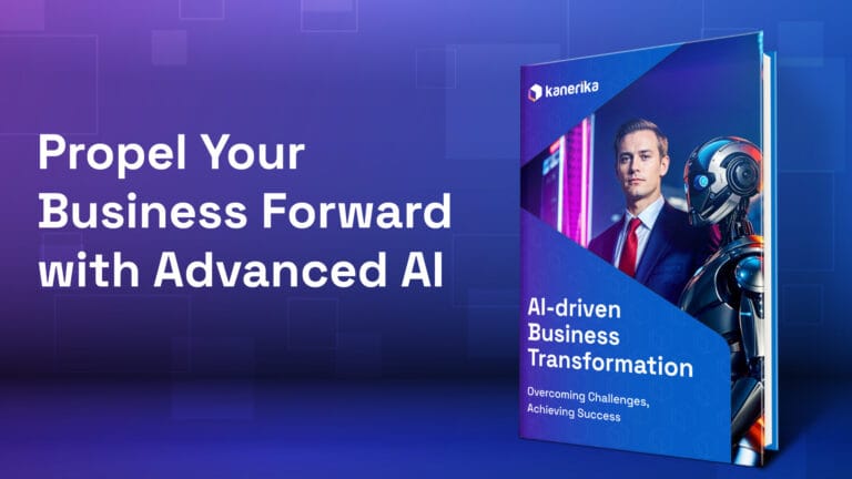
In the past few decades, data has become remarkably beautiful to look at. Every dataset in our surroundings is visualized for our clear understanding. From the weather morning report at the start of our day to fitness tracking apps; data has transcended 0’s and 1’s and now takes the form of beautiful visualizations. A great example is the system used by many public transportation systems that use data visualization in the form of maps, routes, stops, and connections.

But how did our society get to this point?

Data visualization is the graphical representation of data that helps us understand complex information more easily. It benefits us by enabling quicker identification of patterns, trends, and relationships within data, facilitating better decision-making. It also enhances communication by making data more accessible and engaging to a wide range of audiences, promoting effective collaboration and knowledge sharing. 

Now, that we know why data visualization is crucial – how do we get started?


Kanerika’s Three-Step Journey To Data Visualization 

Kanerika’s Three-Step Journey To Data Visualization


Data visualization is a journey. In today’s technologically advanced world, companies actively collect an immense amount of data that not only poses challenges in mapping but also necessitates cleaning before starting out.

Over years of observation, we have summed up the data visualization process into a funnel – beginning with data cleaning, moving on to the next step of data transformation, and finally arriving at data mapping and visualization.

Let’s understand each of the steps in brief.


Data Cleaning

Data cleaning plays a vital role in data visualization as it eliminates errors, inconsistencies, and duplicates within the dataset. Addressing formatting issues and filling in missing data, ensures the accuracy and reliability of visual representations. A thorough data-cleaning process enhances the clarity of insights and prevents misleading interpretations.


Data Transformation

Data transformation is crucial for data visualization because it enables the conversion of raw data into a suitable format for visualization tools, ensuring accuracy and consistency. Transformation allows for data aggregation, filtering, and normalization, enhancing the effectiveness and interpretability of visual representations.


Data Visualization

Now that we have already explored two out of three steps – the third step must seem obvious to you. Data Visualization – the process that simplifies data insights for users. A process that extracts the most important information from raw data/big data and allows business users to derive key business insights.

However, Data Visualization can be notoriously misleading to the untrained eye. Moreover, it is heavily dependent on good-quality data for meaningful insights. Incorrect data, or bad data, can generate misleading data visualization reports that project incorrect information. This can lead to businesses losing out on revenue and making incorrect decisions – a trend that has increased over the past decade due to a large influx of big data for companies.

Recognizing this trend, our team at Kanerika has created the perfect tool to suit the need of every business across industries. A tool that simplifies data integration and transformation. One that ensures your data visualization tool has the correct data to generate reports from. Introducing FLIP!


The AI-Powered FLIP That Visualizes Data For You

The AI-Powered FLIP That Visualizes Data For You


FLIP is an AI-powered data operations platform that optimizes data visualization. It provides businesses with the necessary capabilities to transform and process their data effectively.

And the best part? We have designed FLIP to be used as a zero-code tool that can directly plug into your data lifecycles. Users can utilize it without relying on direct assistance from data engineers or developers. FLIP’s dashboard allows users to import and configure data and segregate them into programs while assigning due dates, partners, and team members responsible for the program. 

But we didn’t stop there. We took it a step further to ensure process configuration and process trends can be viewed directly via the dashboard. FLIP’s integration with visualization tools further facilitates the creation of charts, graphs, dashboards, and other visual representations of data, making it easier for users to interpret and communicate information effectively.


Making Data Visualization Easy with Effortless Data Transformation

FLIP allows users to organize their data into folders of their choice. Users can employ it across various industries including healthcare, fintech, banking, finance, insurance, logistics, HR, and more!

Furthermore, FLIP’s drag-and-drop interface and user-friendly features simplify connecting data sources, defining transformations, and configuring visualization outputs. 

While all the imported data is available to the user in designated folders, FLIP enables users to effortlessly map it into fields. Fields such as string, numeric, date, validation, and variable. This enables users to customize data fields, resulting in highly effective data visualization graphs that are segregated based on custom variables.

For instance, for a healthcare professional, having all the insurance data tagged and configured in one place is challenging. However, FLIP solves that problem. An insurance program can be spread across multiple variables. These include Record Type, Record ID, Program Name, Policy Number, Patient Name, Patient Address, Entry Date, Coverage Limit, Coverage Expiration Date, and Transactions. This allows for a far greater scope of data visualization. Therefore, enables businesses to view individual data variables through the visualization tool of their choice.


The Future Of Data Visualization With FLIP

FLIP Automates DataOps

FLIP Automates DataOps and enables efficient Data Transformation

By seamlessly preparing data for the visualization process, FLIP enables businesses to maximize the potential of their data visualization tools. Additionally, we have designed it to create data transformation pipelines on the go. You can now automate tasks such as data cleaning, aggregation, and formatting. 

Experience the ease of FLIP’s automated processes, and leverage data visualization as a powerful tool for analysis and decision-making. 

Book a demo today!

FAQ

How does FLIP tool address the challenges of data integration and transformation for data visualization?

FLIP is a tool created to simplify data integration and transformation, ensuring that data visualization tools have the correct data to generate reports from. It streamlines the data visualization process and helps businesses across industries overcome data-related challenges.

Why is data cleaning important in the data visualization process?

Data cleaning is crucial because it eliminates errors, inconsistencies, and duplicates within the dataset. It ensures the accuracy and reliability of visual representations, enhances the clarity of insights, and prevents misleading interpretations.

What are the key benefits of using FLIP for data visualization?

The key benefits of using FLIP for data visualization include simplified data transformation, user-friendly features, customization options, integration with visualization tools, and the ability to organize data efficiently. It streamlines the data visualization process, making it accessible to a wide range of users.

In which industries can FLIP be used for data visualization?

FLIP can be employed across various industries, including healthcare, fintech, banking, finance, insurance, logistics, HR, and more. Its flexibility and customization options make it suitable for a wide range of business sectors.

Can FLIP be used by non-technical users for data visualization and DataOps?

Yes, FLIP is designed to be user-friendly and does not require advanced technical skills. Non-technical users can leverage FLIP's automation features to prepare data for visualization efficiently.

How does FLIP contribute to the future of data analytics and visualization?

FLIP contributes to the future of data analytics and visualization by automating and simplifying the data preparation process. This empowers businesses to focus on deriving insights from their data, accelerating the pace of data-driven innovation.

What sets FLIP apart from other data visualization tools?

FLIP stands out as a zero-code tool that can directly integrate into data lifecycles. Users can utilize FLIP without the need for direct assistance from data engineers or developers. Its user-friendly features and drag-and-drop interface simplify connecting data sources, defining transformations, and configuring visualization outputs.

How can businesses ensure the accuracy of data visualization reports?

To ensure accuracy, businesses should focus on data cleaning and transformation to prepare data properly before visualization. Additionally, using tools like FLIP can help simplify data integration and transformation, ensuring that visualization tools have correct data for generating accurate reports.

Can you tell us more about FLIP and how it aids in data visualization?

FLIP is a tool designed to simplify data integration and transformation. It ensures that data visualization tools have the correct data to generate accurate reports. By automating data preparation tasks, FLIP enhances the accuracy and effectiveness of data visualization.

Follow us on LinkedIn and Twitter for insightful industry news, business updates and all the latest data trends online.