If you embark on a treasure hunt, would you choose a basic black-and-white map or a colorful, detailed one?
The colorful one, right?
Much like a vibrant map makes the treasure hunt engaging and informative, data visualization brings a similar vibrancy to business decision-making. It turns the black-and-white numbers of raw data into a colorful narrative, revealing hidden patterns, trends, and insights that guide companies toward their ‘treasure’ of success.
In the age of big data, the ability to visualize information effectively is not just a technical skill but a critical aspect of your professional toolkit. Organizations across various sectors harness the power of data visualization to communicate messages clearly, highlight key facts, and support strategic business decisions. It’s a discipline that combines design, analysis, and storytelling, making it an engaging intersection of art and science.
Your grasp of data visualization can be the difference between merely having access to data and making sense of it to drive action. From simple bar charts to sophisticated interactive visualizations, they are an indispensable part of how you consume and understand information in a data-driven world. As the volume and complexity of data continue to expand, so too does the imperative for clear and effective visual communication of this data.
Table of Contents
- Why is data visualization important?
- Design Principles
- Visual Types
- Data Visualization Tools
- Data Handling Techniques
- Interactive Data Visualization
- Future Trends
- Common Data Visualization Use Cases
- Case Study- The Role of Data Visualization in Talent Acquisition
- The Results
- Time for you to utilize Data Visualization
- FAQs
Why is Data Visualization Important?
Data visualization enables modern businesses to navigate, transforming complex, raw datasets into an intuitive, colorful narrative. This process not only democratizes data, making it accessible and understandable to all levels of an organization, but also uncovers hidden patterns, trends, and insights critical for informed decision-making.
By converting numbers and statistics into visual stories, data visualization enables companies to grasp the significance behind their data quickly, guiding strategic choices and paving the way to uncovering the ‘treasure’ of competitive advantage and success. It’s a tool that doesn’t just simplify information; it illuminates the path forward, making business achievements engaging and efficient.

Design Principles
In the realm of data visualization, the clarity and effectiveness of your presentation are paramount. These design principles are your essential tools to help ensure that your visuals communicate the intended message efficiently and accurately.
1. Choosing the Right Chart Type
Your selection of chart type is crucial—it can either illuminate the data or muddle it. For instance, use bar charts for comparisons among discrete categories and line charts to illustrate continuous data over time. Choosing inappropriately can obfuscate your insights, so always align your chart type with the nature of your data and the story you’re aiming to tell.
2. Color Theory and Accessibility
Color selection influences not just aesthetics but also the readability and interpretability of your data visualization. Colors have meanings and can evoke emotional responses. Use colors consistently to help your audience quickly understand patterns and relationships. Also, consider colorblind-friendly palettes to ensure accessibility for all viewers.
3. Layout and Composition
The layout is your visualization framework, and composition directs the viewer’s eye across the information. Organizing your visual elements strategically is necessary to maintain balance and flow. For instance, placing key elements like your most significant findings in the upper left corner can follow the natural reading path. Keep your layout clean, avoiding clutter, to maintain focus on the data. The principles of Gestalt, such as proximity and continuity, guide viewers to group and interpret your visual elements naturally as intended.

Visual Types
Data visualization encompasses a wide range of techniques and tools designed to represent complex data visually, making information more accessible and understandable. Here are some key examples of data visualization types, each tailored to showcase different aspects of data in unique and insightful ways:
Bar Charts:
Ideal for comparing quantities across different categories, bar charts are straightforward yet powerful, enabling viewers to discern relative sizes of data points quickly
Line Graphs:
Perfect for displaying data over time, line graphs help identify trends, peaks, and valleys, making them essential for analyzing performance metrics and forecasting
Pie Charts:
Useful for showing proportions within a whole, pie charts visually break down data into slices, making it easy to understand part-to-whole relationships
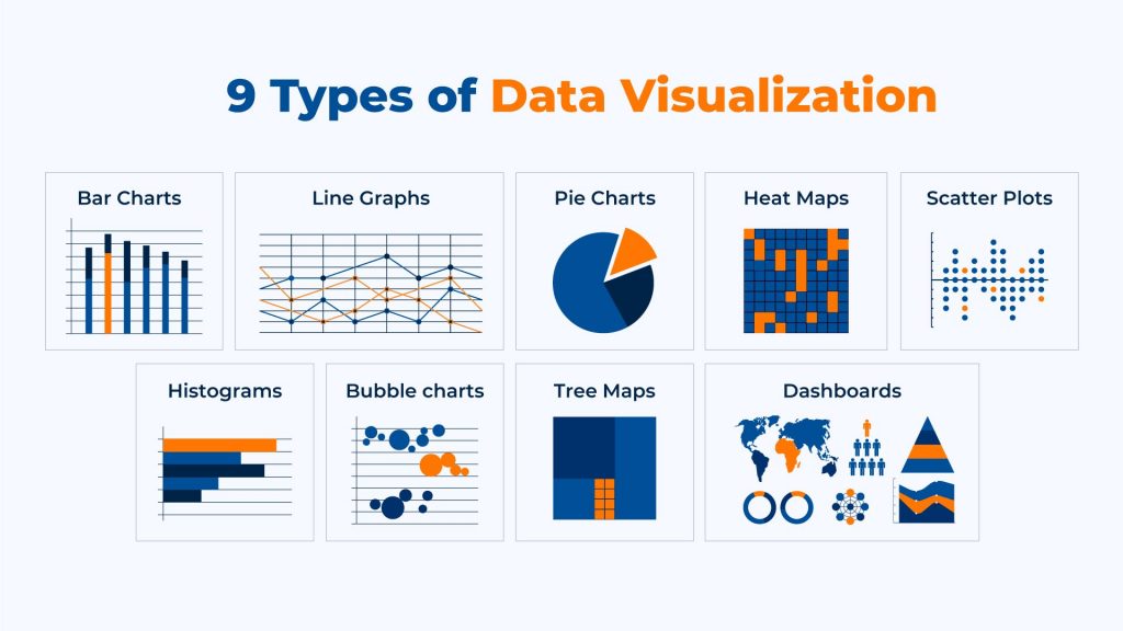
Heat Maps:
Heat maps use color variations to represent complex data sets in a two-dimensional image, ideal for identifying patterns, variations, and density in data, especially in areas like website analytics or geographic distributions
Scatter Plots:
Scatter plots display the relationship between two variables, helping to uncover correlations and trends. Each point on the scatter plot represents an individual data point, making it invaluable for regression analysis and outlier identification
Histograms:
Similar to bar charts but used for continuous data grouped into ranges, histograms are great for showing the distribution or variation of a dataset, helping to identify skewness and the presence of multiple peaks in data

Bubble Charts:
An extension of scatter plots, bubble charts add an additional dimension through the size of the bubbles, allowing for the comparison of three variables at once. They’re particularly useful for displaying the relationship between data points in terms of volume, cost, or importance
Tree Maps:
Tree maps display hierarchical data as a set of nested rectangles, each sized and colored according to its value or significance. This makes them useful for visualizing complex data structures, such as the distribution of market segments or organizational structures
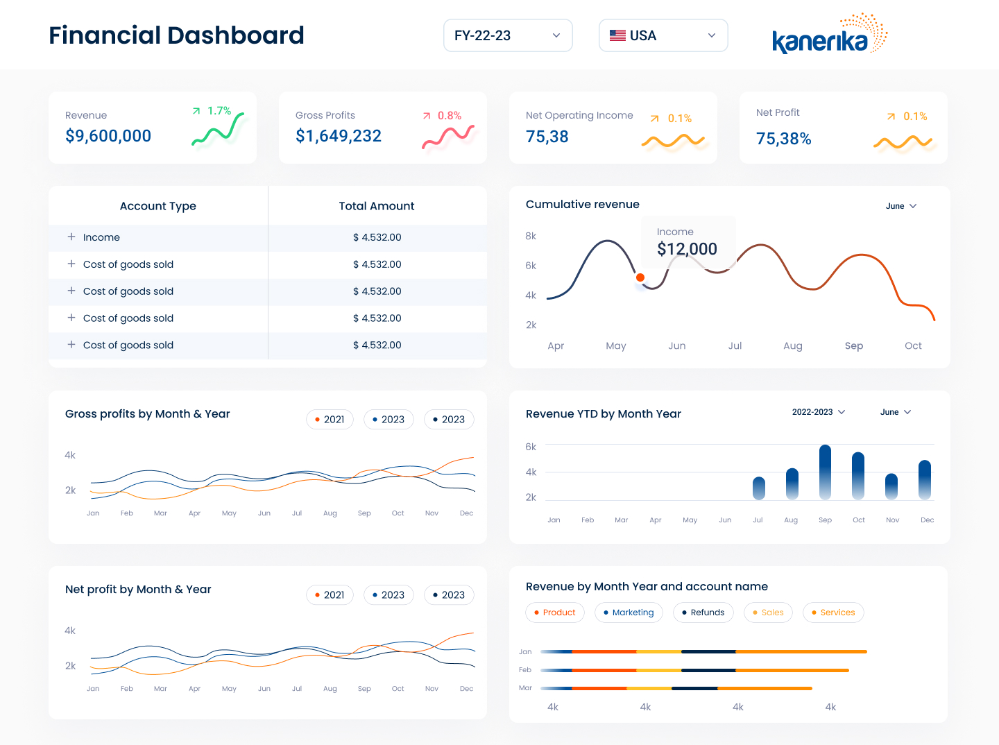
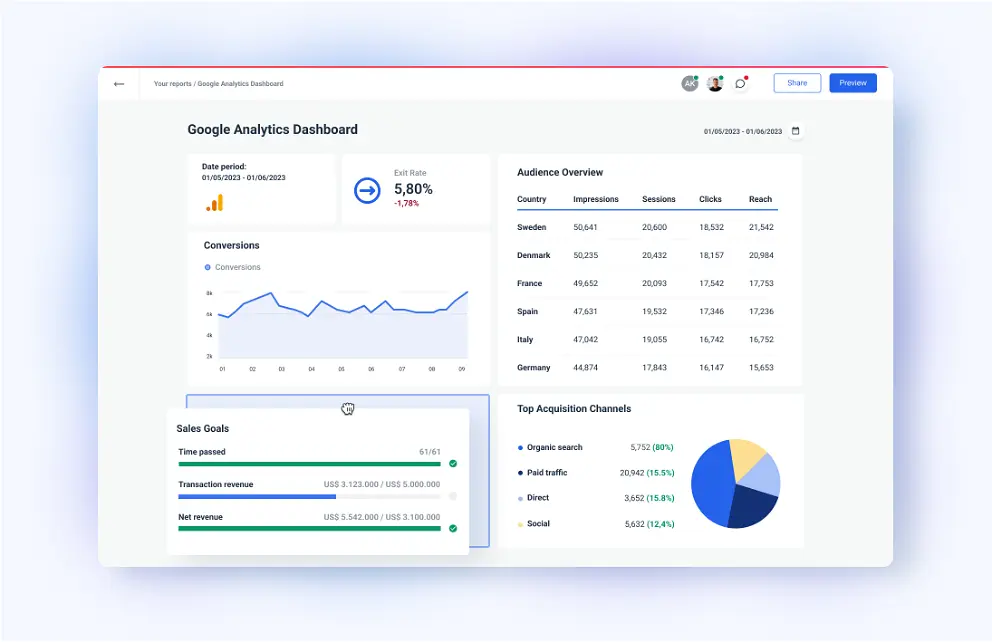
Dashboards:
Dashboards combine multiple data visualizations to provide an at-a-glance overview of key performance indicators (KPIs), metrics, and data points, enabling decision-makers to monitor performance and trends in real-time
Data Visualization Tools
Data visualization tools are integral for transforming complex data into comprehensible and actionable visual representations. These tools come in various forms, each catering to different levels of technical expertise and specific use cases.
Programming Libraries
Python and R are leading programming languages that offer a rich set of libraries for data visualization.
Python:
- Matplotlib: Offers a wide array of static, animated, and interactive visualizations. It is highly customizable and works well for creating publication-quality plots
- Seaborn: Based on Matplotlib, it provides a high-level interface for drawing attractive and informative statistical graphics
R:
- ggplot2: Utilizes a powerful grammar of graphics to create complex and aesthetically pleasing visuals
- Shiny: Helps in building interactive web apps straight from R
These libraries require a good understanding of programming, but they offer flexibility and power for your custom visualization needs.

Software Platforms
There are software platforms designed to provide user-friendly interfaces and allow you to create sophisticated data visualizations without deep programming knowledge.
- Tableau: A leading platform that offers extensive capabilities for interactive charts and real-time data analytics.
- Microsoft Power BI: Best suited for business intelligence, Power BI integrates well with other Microsoft products, providing robust data analysis and sharing capabilities.
Choosing between these platforms often depends on your specific data analysis needs and the level of control you require. Software platforms offer a balance between ease of use and comprehensive visualization features.

Data Handling Techniques
Effective data visualization hinges on the integrity and structure of underlying data. Your ability to clean and transform data directly impacts the clarity and accuracy of your visual output.
Data Cleaning
Data cleaning is a mandatory step to ensure that your data sets are free of errors and inconsistencies. It involves identifying and correcting (or removing) errors and inconsistencies to improve the quality of your data. Techniques include:
- Removing duplicates: Eliminate repeated data entries to avoid skewed analysis
- Correcting errors: Fix mislabeled categories, typos, or incorrect data entries
- Filling missing values: Input missing data when possible or analyze the impact of missing data
- Filtering irrelevant information: Exclude data that does not contribute to your analysis
Data Transformation
Data transformation involves changing the format, structure, or values of data. You perform this step to convert data into a suitable format or structure for analysis and visualization. Key transformations include:
- Normalization: Scale numerical data to fall within a smaller, common range
- Aggregation: Summarize data by combining multiple records into a single value to reduce complexity
- Categorization: Group data into categories to simplify analysis
- Indexing: Convert categorical data to numerical form for various analytical methods

Interactive Data Visualization
Interactive Data Visualization enables you to engage directly with data, revealing deeper insights and trends through your interaction. This dynamic approach to data presentation transforms how you comprehend and process complex information.
Interactivity Elements
- Customization: You can alter visual elements such as colors, chart types, and filters, which tailor the visualization to your needs
- Drill-downs: Gain access to detailed data layers by clicking or selecting specific visualization parts, bringing forth granular information pertinent to your inquiry
- Zoom: Expand specific sections for a closer look or contract them to return to a more generalized dataset view
User Engagement Metrics
- Click-through Rates: Measures how frequently you interact with the visualization elements, indicating the compelling nature of the data presentation.
- Time Spent: The duration you spend interacting with the visualization hints at the effectiveness of the visualization in maintaining your interest and facilitating exploration.

Future Trends
Advancements in technology and a surge in data generation are transforming how you interact with and gain insights from data. The following sections will walk you through two significant trends shaping the future of data visualization.
Augmented and Virtual Reality
Augmented reality (AR) and virtual reality (VR) are set to revolutionize the way you experience data visualization. With AR, you can overlay data visuals onto the real world, enhancing your understanding of complex information in a contextual environment. For example, architects can view building data superimposed on physical locations. VR creates immersive environments where you can interact with data in three dimensions, like exploring a geographical landscape to understand demographic data.
- AR application: On-site analytics for real-world scenarios
- VR application: Interactive, spatial analyses for comprehensive insight
AR and VR provide a unique opportunity for collaboration in data analysis, allowing multiple users to explore and discuss data within a virtual space.

Artificial Intelligence in Data Visualization
Artificial intelligence (AI) incorporates complex algorithms to transform how you analyze and visualize data. AI enables data visualization tools to identify patterns, predict trends, and create visuals autonomously. This means more intuitive and insightful visualizations tailored to your specific needs.
- AI capabilities: Pattern recognition, predictive analytics, and automated reporting
- Benefits for you: Time-saving, accuracy, and personalized data stories
By synthesizing vast amounts of data, AI in data visualization helps you make quicker, evidence-based decisions. As AI technology evolves, expect to see more sophisticated and interactive visualizations that can adapt to your changing questions and focus.

Common Data Visualization Use Cases
The application of data visualization across these diverse business functions underscores its importance in modern business operations. It not only enhances understanding and insight but also empowers businesses to act swiftly and with confidence in a data-driven world.
Operations:
Data visualization significantly enhances operational efficiency by streamlining processes, boosting productivity, and cutting costs. It makes logistics, inventory, and production timelines easier to understand, helping businesses pinpoint inefficiencies, predict needs, and allocate resources wisely for smoother operations and improved customer satisfaction.
HR and Talent Acquisition:
In HR and talent acquisition, visual data analysis reveals trends in employee turnover, hiring, and diversity. This insight aids in refining recruitment strategies, retaining valuable employees, and building a diverse workplace, thereby strengthening the organization’s human capital.
Marketing:
Data visualization is crucial for marketing, offering insights into customer behavior and market trends. By analyzing data visually, marketers can fine-tune strategies for better targeting, optimize budgets, and enhance campaign effectiveness, driving stronger engagement and results.
Sales:
For sales teams, data visualization provides a clear view of performance metrics and customer interactions. This supports the development of smarter sales strategies, fosters better customer relationships, and improves forecasting, contributing to revenue growth.
Finance:
Finance departments rely on data visualization for managing budgets, forecasting finances, and assessing risks. Visual tools help in presenting complex data simply, allowing for trend identification, risk management, and strategic decision-making to support financial stability and growth.
Supply Chain Management:
In supply chain management, data visualization aids in monitoring the flow of goods and anticipating disruptions. It helps optimize inventory and improve supplier relations, ensuring efficient deliveries and cost reduction.

Case Study- The Role of Data Visualization in Talent Acquisition
At Kanerika, recognizing talent acquisition as a strategic cornerstone for our growth in the tech solutions arena, we initiated a pilot project with our Talent Acquisition (TA) team to leverage data visualization for enhancing our recruitment processes.
Our commitment to operational excellence and strategic alignment drove this endeavor to introduce an internal dashboard- tracking recruiter productivity, hire qualities, and time taken for each hire. It aimed to transform our recruitment approach, making it more efficient and attuned to Kanerika’s overarching goals.
The dashboard’s implementation revolutionized our TA operations by providing clear, actionable insights from complex data, enabling smarter, data-driven decision-making. This pilot not only streamlined our recruitment process but also significantly aligned our talent acquisition efforts with our broader business strategies, marking a pivotal advancement in our pursuit of top talent and reinforcing our competitive edge in the tech industry.
1. Enhanced Understanding of Recruitment Metrics:
We wanted to enable our recruitment teams to see beyond raw numbers. By presenting complex data sets in visual formats like charts, graphs, and heat maps, visualization made it easier to understand key recruitment metrics such as time-to-hire, source effectiveness, and applicant drop-off rates. These insights proved crucial for identifying areas of strength and opportunities for improvement in the recruitment process.
2. Strategic Decision Making:
With data visualization, talent acquisition becomes a strategic function. The visual dashboard’s ability to present data in an easily digestible form allows the TA team to spot trends, predict outcomes, and make data-backed decisions. For example, visualizing the success rate of different recruitment channels to allocate resources more effectively. It ensures that efforts are concentrated where they yield the best results.
3. Efficiency and Productivity:
We wanted to simplify the interpretation of vast recruitment data, saving time and increasing productivity. Our recruiters can now quickly identify patterns, monitor real-time analytics, and respond promptly to changing dynamics in the talent market. This efficiency is particularly beneficial in fast-paced services industry recruitment environments where quick decision-making is critical.

The Results
The transformation in Kanerika’s recruitment process after the adoption of data visualization dashboards is both strategic and impactful, marking a shift towards greater efficiency, insight-driven strategy formulation, and enhanced overall effectiveness.
| Aspect | Before Visualization Implementation | After Visualization Implementation |
|---|---|---|
| Data Management | Manual compilation and analysis from disparate sources, time-intensive and prone to inaccuracies. | Streamlined through data visualization tools, consolidating information from job portals and recruitment platforms, enhancing efficiency. |
| Strategic Insight | Lacked depth, often guided by anecdotal evidence and generic trends. | Empowered by real-time analytics for precision in targeting and timing, enabling data-driven strategies. |
| Decision-Making Speed | Slower, due to manual data parsing for actionable intelligence, risking loss of top talent. | Quicker and more informed, with dashboard’s intuitive design facilitating rapid data interpretation, significantly reducing time from identification to hire. |
| Approach to Talent Acquisition | Reactive, responding to immediate hiring needs without strategic planning. | Proactive, using predictive analytics for forecasting hiring needs and identifying trends, allowing for strategic planning and ensuring competitiveness in talent acquisition. |
This strategic overhaul, driven by the adoption of data visualization, has not only optimized Kanerika’s recruitment process but also positioned the company to anticipate better and meet future talent needs, securing a significant competitive edge in the tech solutions market.
“As the Talent Acquisition Team Manager at Kanerika, integrating data analytics into our processes has been a game-changer. It’s now remarkably simpler for me to gauge our current standing – understanding which roles are difficult to fill, pinpointing process bottlenecks, and identifying where my team is exerting their maximum efforts. Data retrieval, once a time-consuming task, has become swift and efficient. This transformation has streamlined my ability to communicate the recruitment status and challenges to hiring managers effectively, ensuring we’re all on the same page and working towards a common goal.”- Meenakshi

Time to Utilize Data Visualization
Embracing simple tricks like data visualization can be an upgrade and cause a necessary shift to stay competitive and effective. From the internal implementation, if your current recruitment process (or any other business process for that matter) is facing challenges in handling tasks, planning resources, slow decision-making, or lack of strategic insight, it’s time to consider a transformation.
Kanerika stands at the forefront of addressing your data visualization needs. We offer cutting-edge solutions that transform complex data into actionable insights.
Kanerika boosts operational efficiency and strategic decisions with intuitive dashboards, simplifying data complexity. Our data visualization crafts a clear narrative for quick, informed decisions. Benefit from Kanerika’s custom strategies for growth and competitive edge. Our solutions tackle modern data challenges, enhancing recruitment and operations. Choosing Kanerika adds clarity, efficiency, and foresight, keeping your business agile and ahead in the data-driven landscape.